this was my first opportunity to design the light source itself rather than only the form around it. As an industrial designer, I usually approach lighting through object language, physical structure, and the way a fixture exists in space. This project shifted that perspective by asking me to think about light as the primary material.
Rather than treating light as a secondary effect of an object, I explored how the source, direction, diffusion, and gradient of light could be intentionally shaped. This allowed me to study how subtle changes in light behavior can influence atmosphere, perception, and the user’s experience of the piece.
Research Summary
Through user feedback and lighting research, I found that warmer, softer lighting was consistently associated with comfort, relaxation, and reduced stress. Participants responded especially well to gradual lighting transitions, describing them as more natural and emotionally supportive than harsh single-tone light. These findings helped frame lighting not just as illumination, but as a tool for shaping mood, atmosphere, and well-being.
Design Direction
Using these insights, I focused on creating custom gradient lenses that could control the behavior of light at the source. Through UV printing, I tested variables such as opacity, distance, color, and diffusion to study how each adjustment changed the final lighting effect. The goal was to translate user feedback into a resolved lighting form that felt soft, atmospheric, and emotionally responsive.

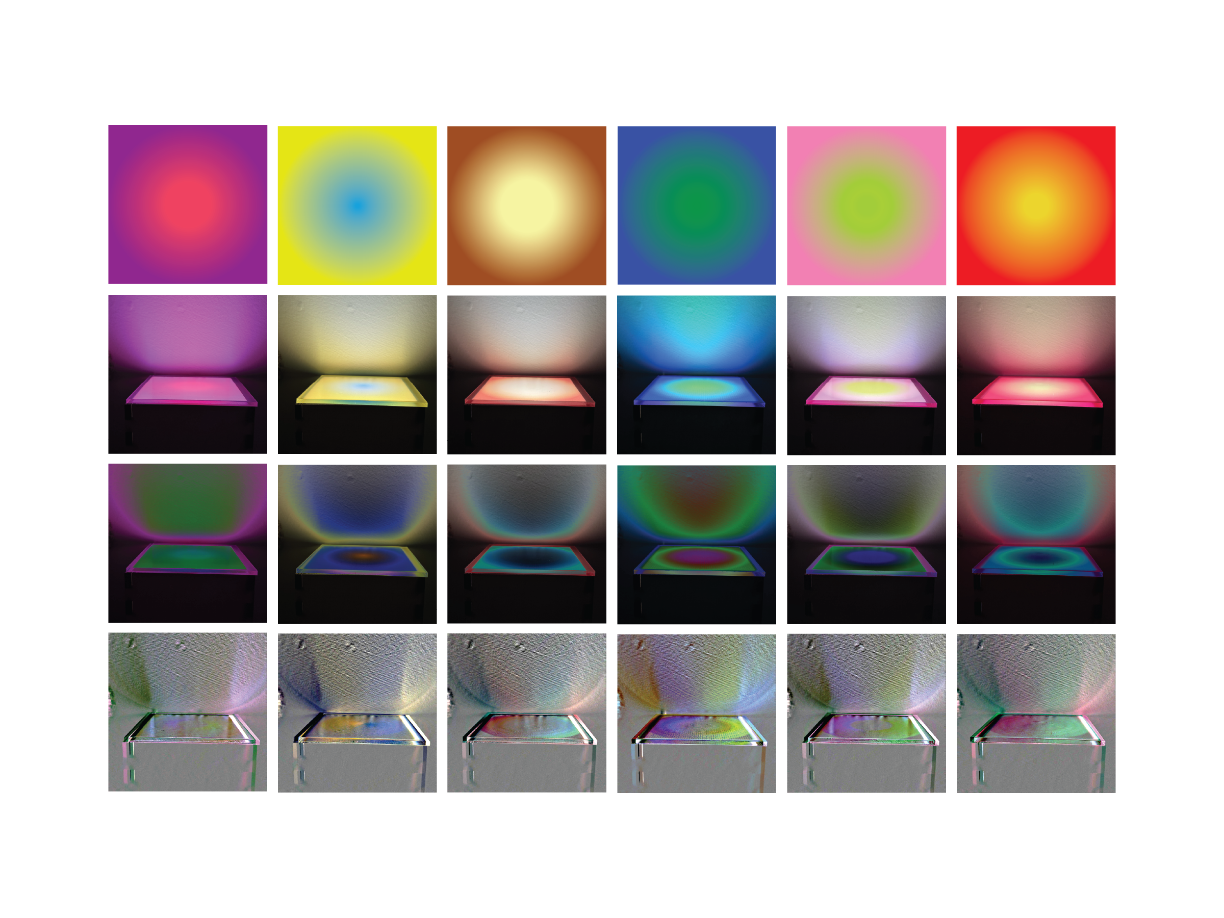
Throughout this phase, I spent a lot of time exploring how much visual and experiential variety could come from color gradients. I used my research into color perception, the retina, circadian rhythm, and the psychological effects of light to develop six gradient swatches for user testing.
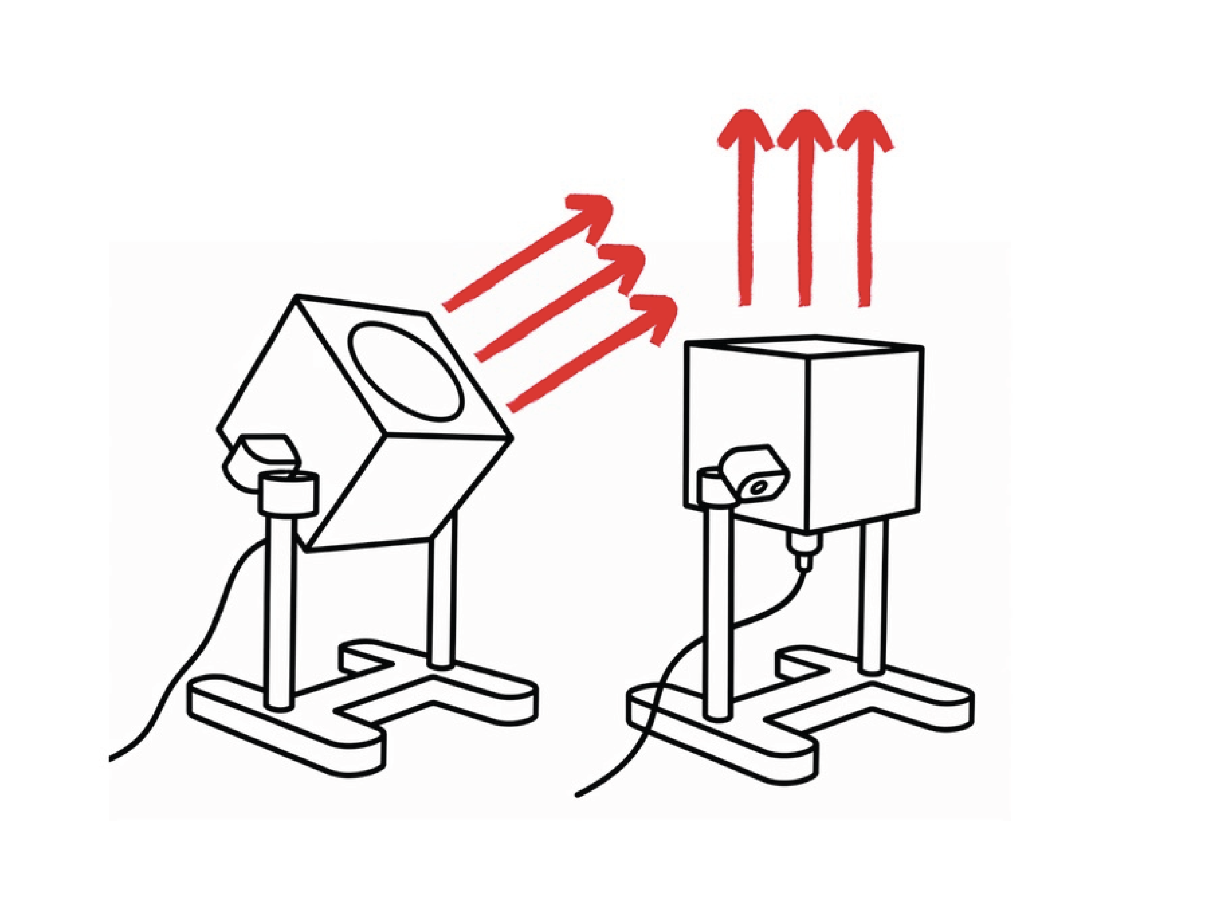
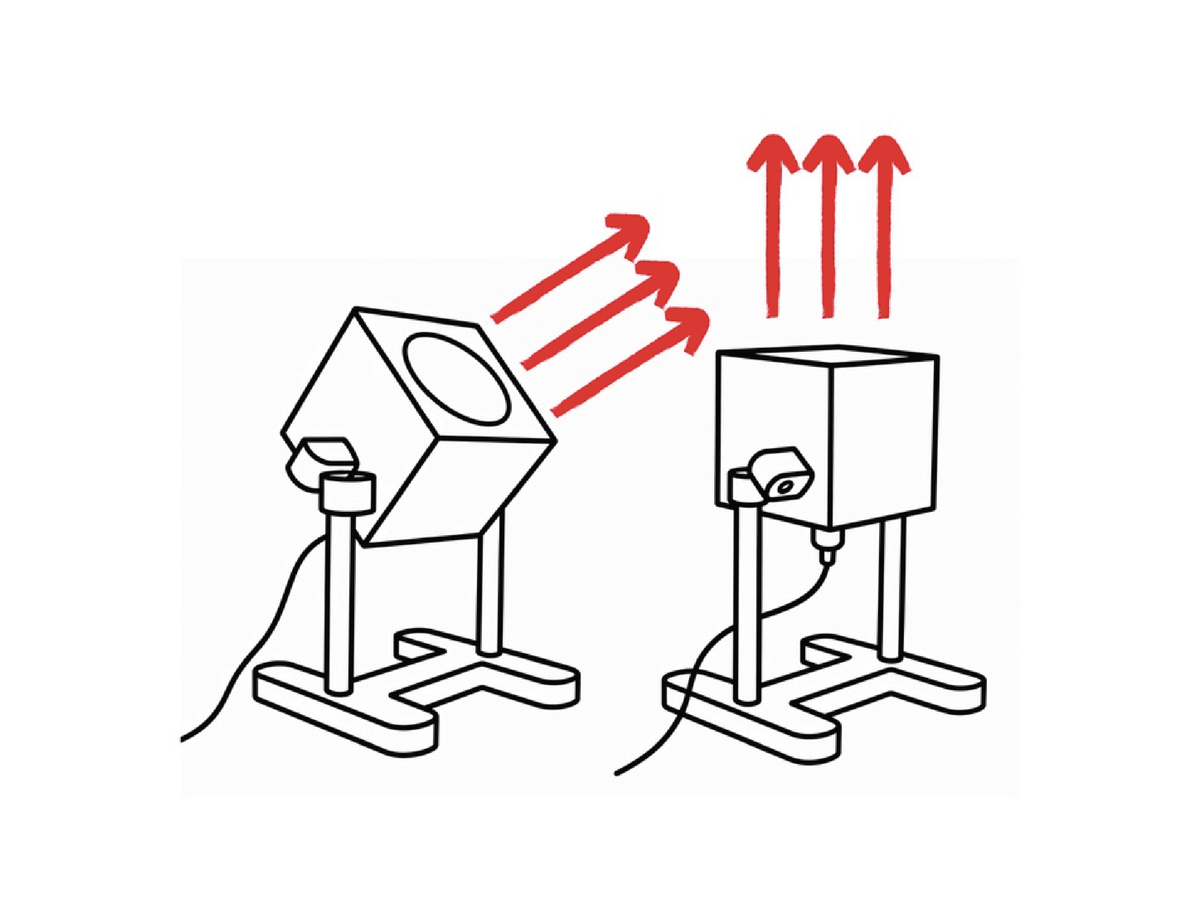
While creating these swatches, I was not only thinking about color, but also about how the light would behave in the final form. I had to consider direction, diffusion, brightness, and how the lamp would be positioned in a real space. Since the lamp is meant to face away from the user and project light toward a wall, the back of the piece became just as important as the front. This shifted the design from being only about the object’s appearance to being about how the light interacts with the surrounding environment.

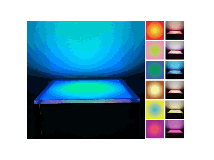
I finalized these gradients for the user study to better understand how each one behaved in real lighting conditions. Each sample was tested through a baseline render, light output, intensity mapping, and form direction map.
This helped me compare not only the color palettes, but how each gradient projected onto the wall, filled the space, and changed through reflection and direction.
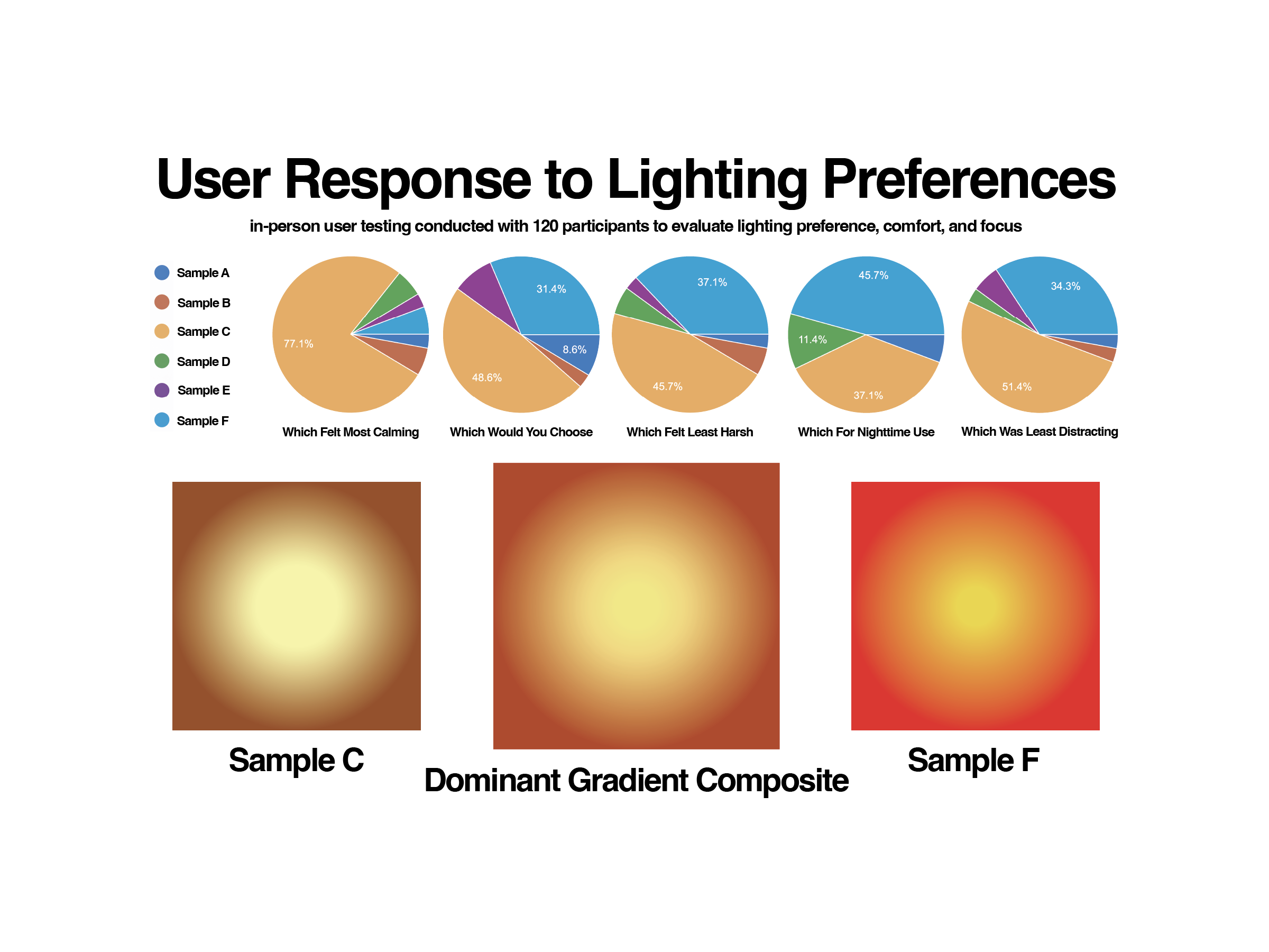
I conducted in-person user testing with 120 participants to evaluate the six lighting gradients. I wanted the project to be shaped by real responses rather than only prior research, assumptions, or fictional user personas.
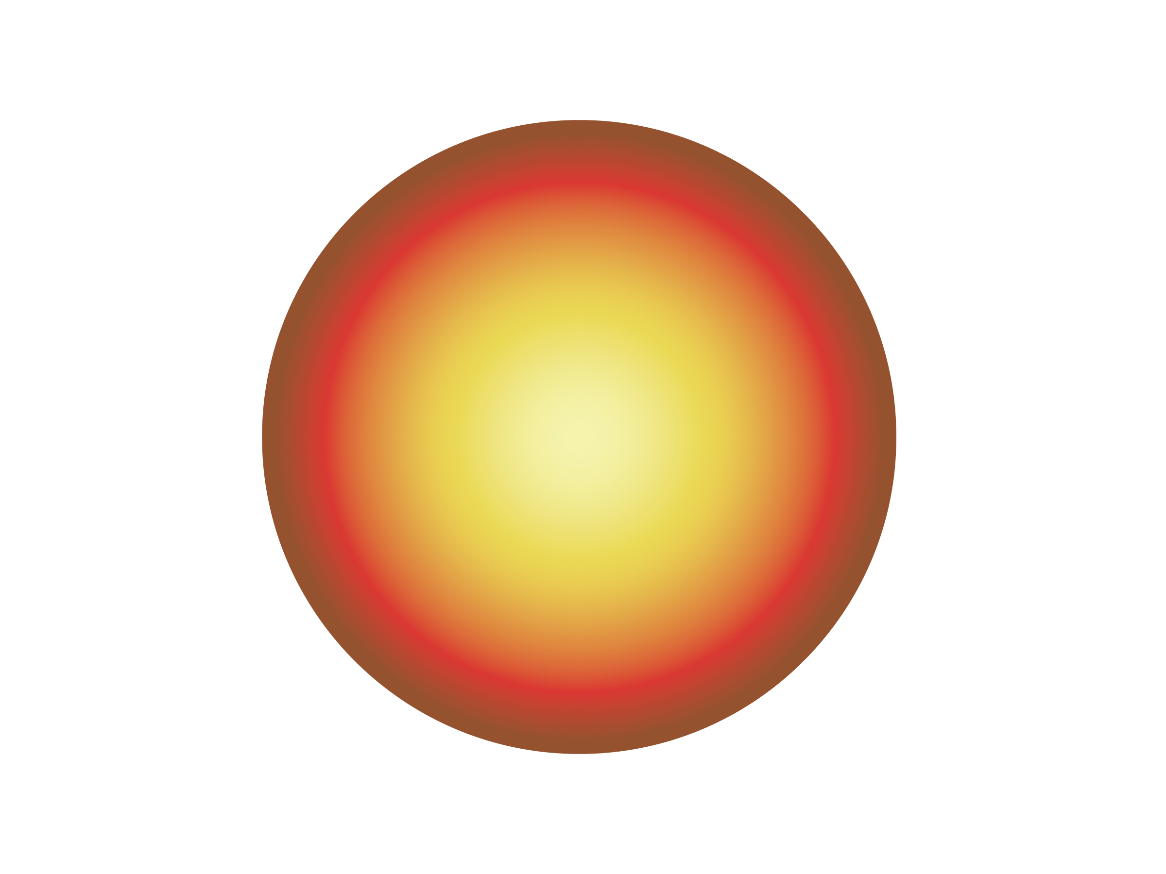
Participants answered questions about which gradient felt most calming, least harsh, best for nighttime use, least distracting, and which one they would personally choose. Samples C and F received the strongest responses, so I combined their most successful qualities into a dominant gradient composite for the final lighting direction.
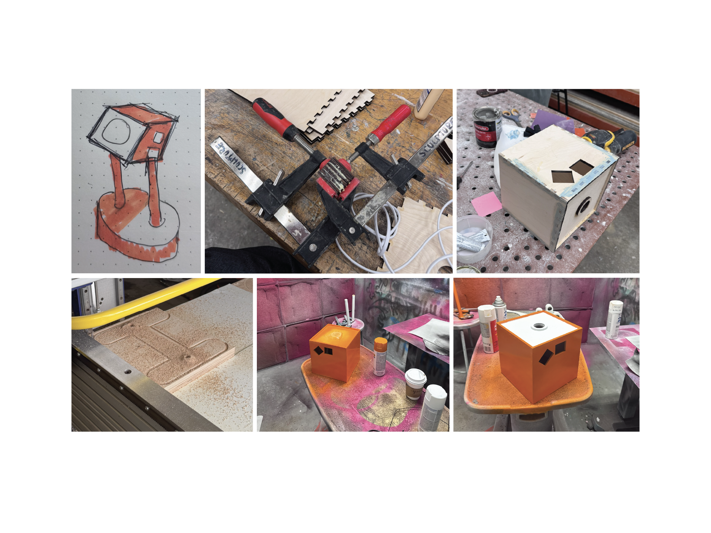
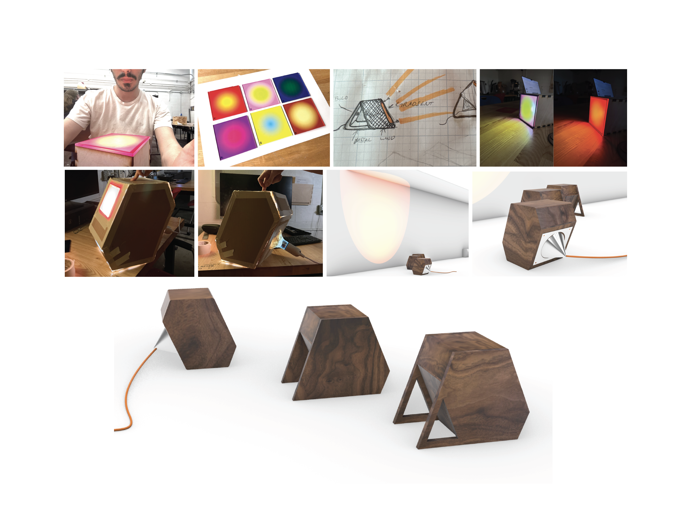
fabrication
I kept in mind that the project was not mainly about designing the form, but about designing the light source itself. I created a form that was visually simple, large enough to showcase the gradient, and quiet enough to let the light remain the focus.
I also wanted to avoid overcomplicating the mechanics. Since much of my design philosophy is rooted in analog interaction, I focused on the two most important lighting directions: straight up and 45 degrees. The lamp can also rotate 360 degrees, allowing users to aim the light in any direction they want.
For the final colors, I chose orange and white. The orange gives the object energy and vibrancy when the lamp is off, while the white helps it feel clean and less distracting when the light is on.