Klotter (noun): to scribble, doodle, or make messy markings.
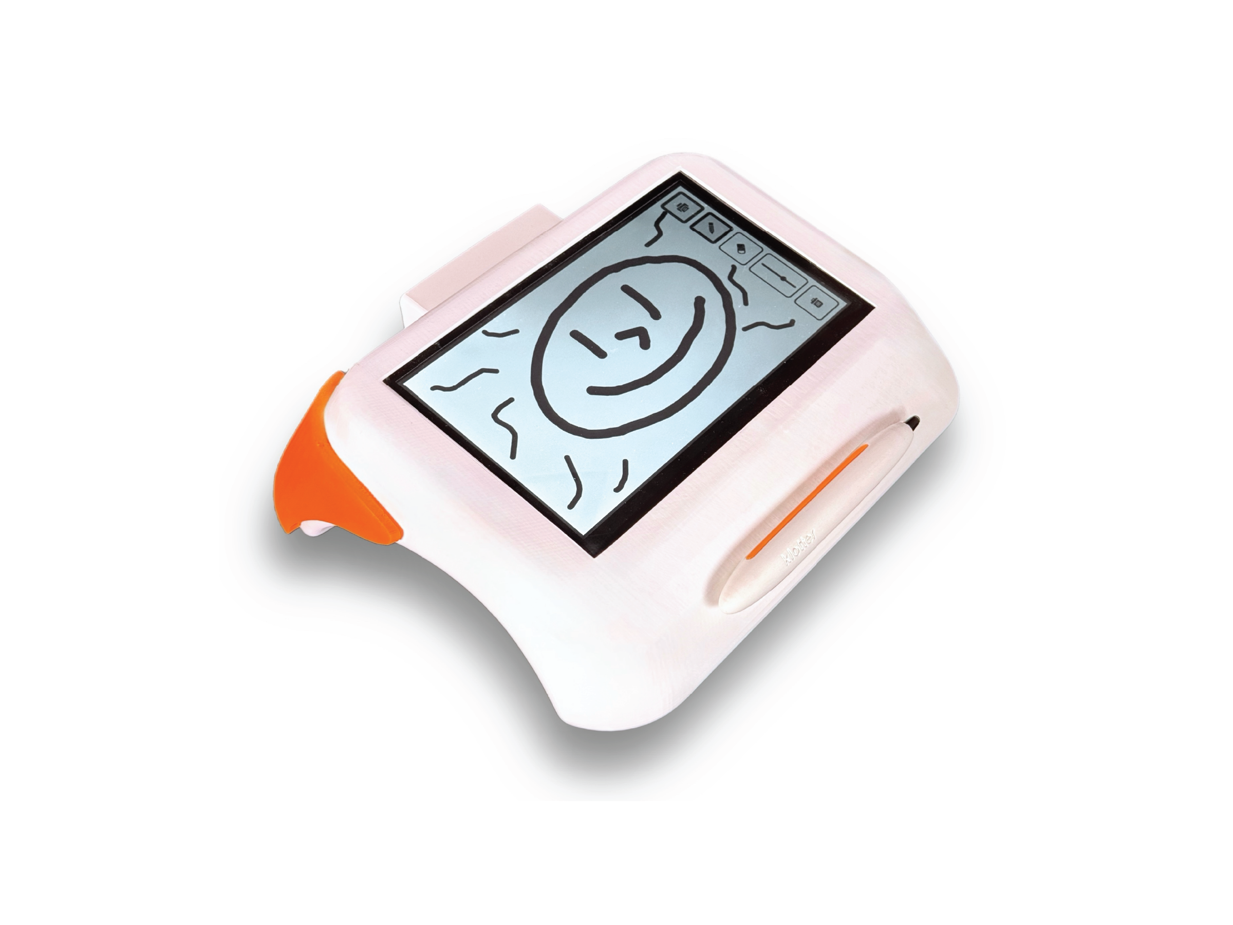
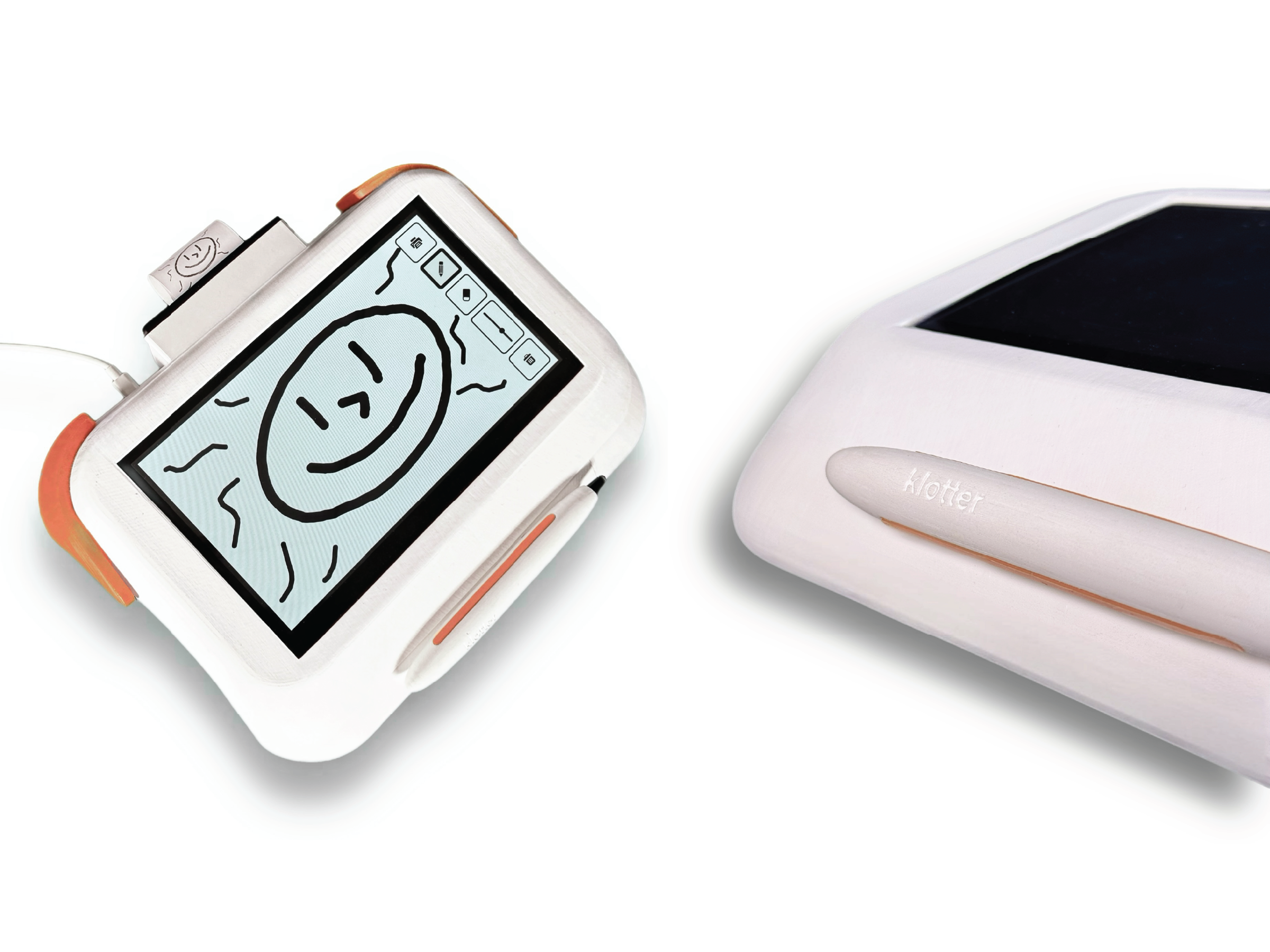
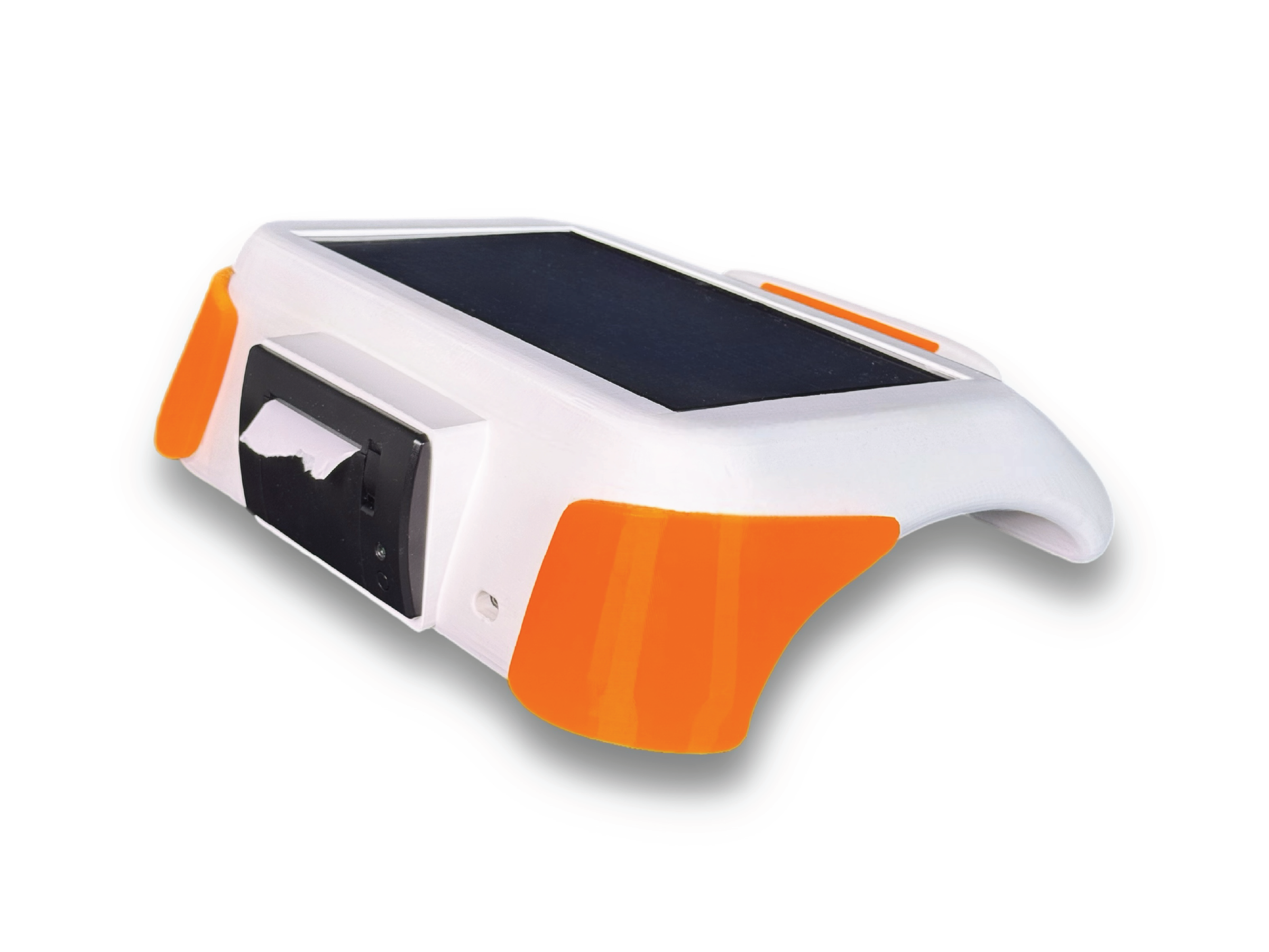
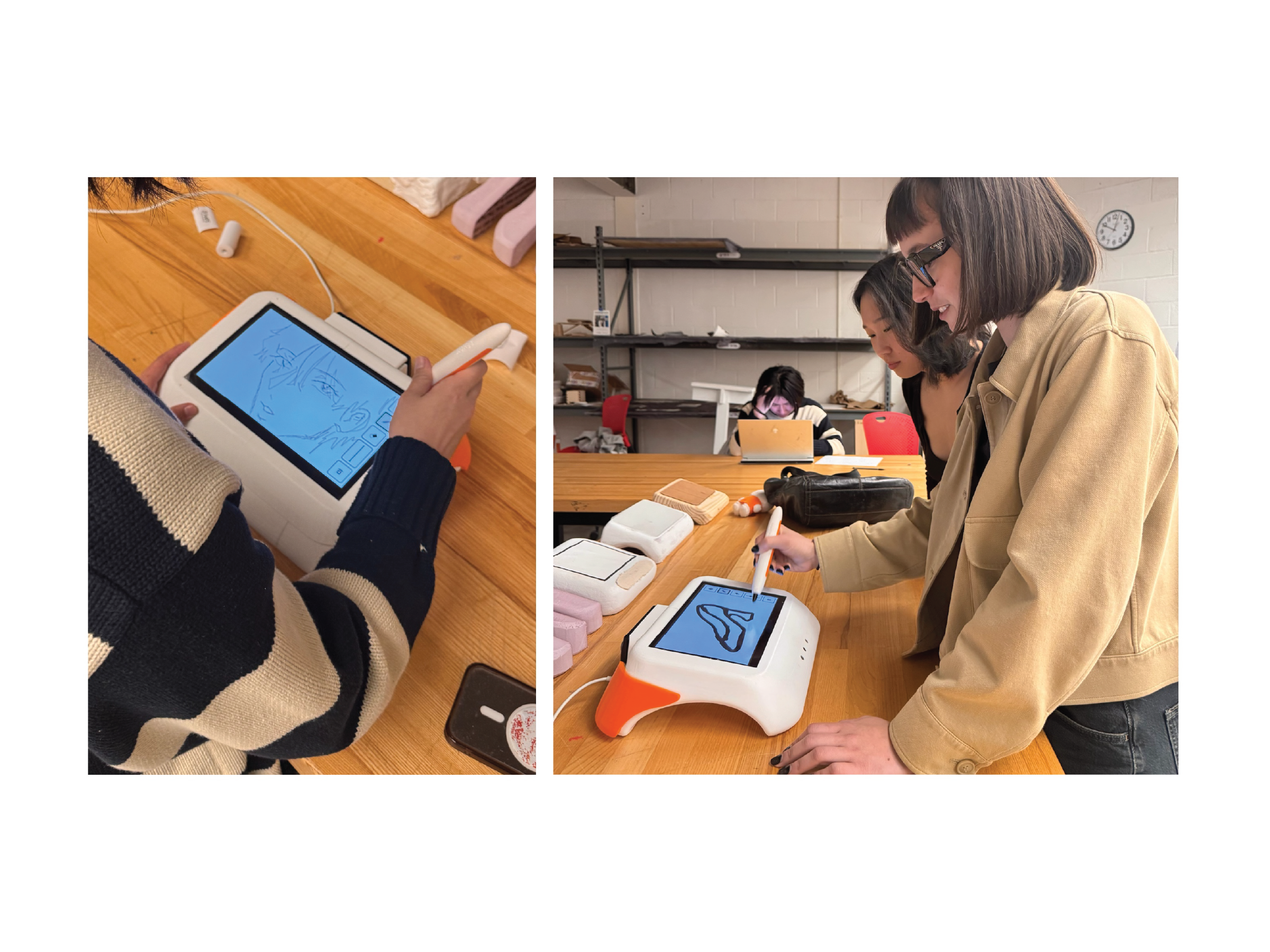
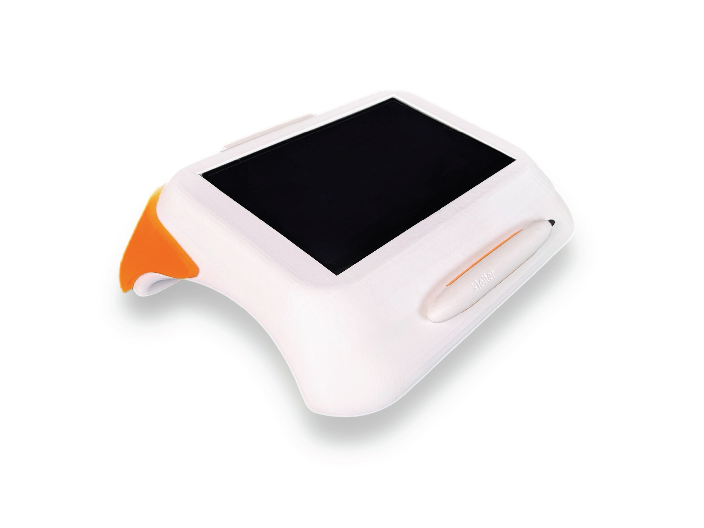
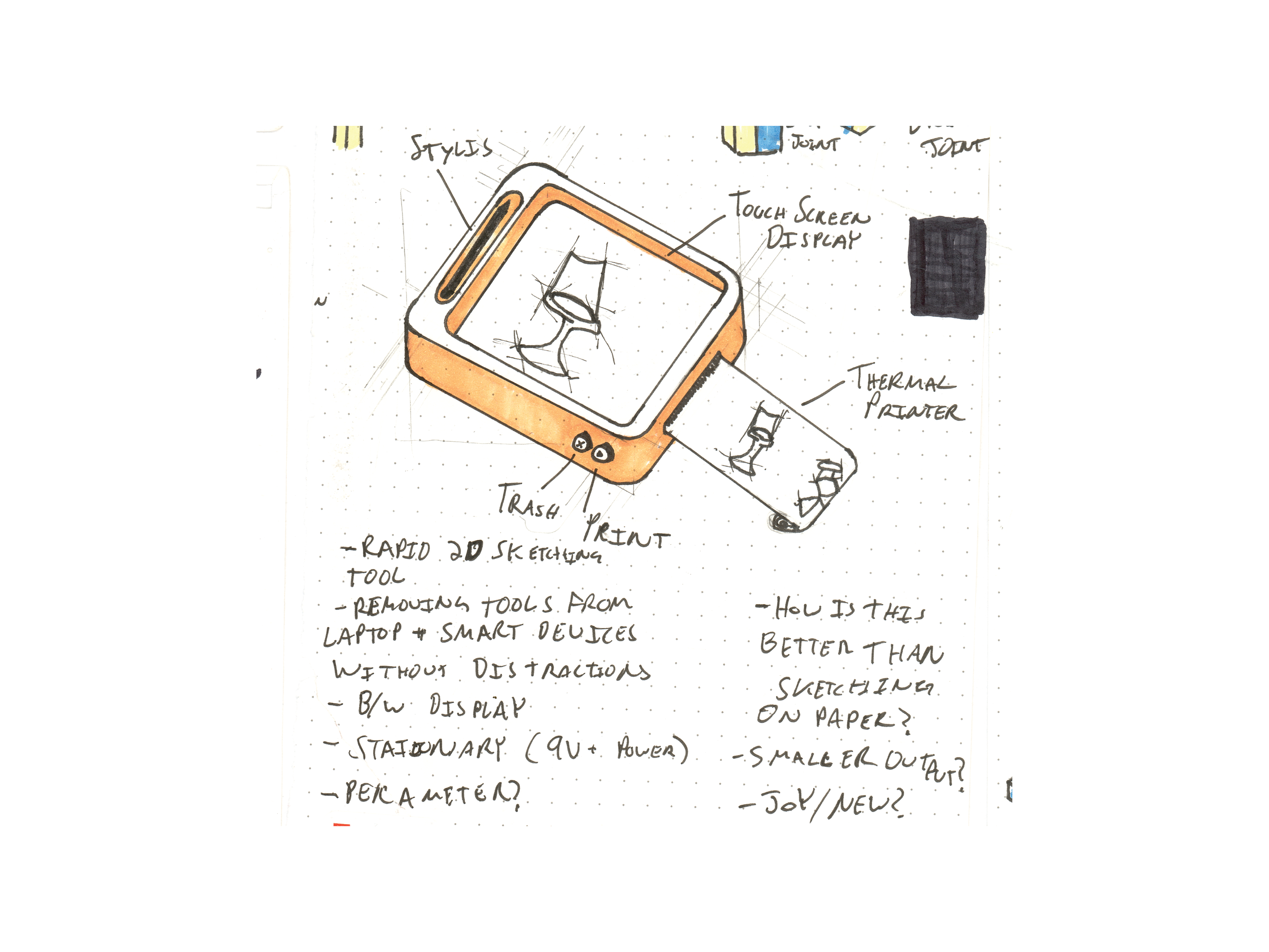
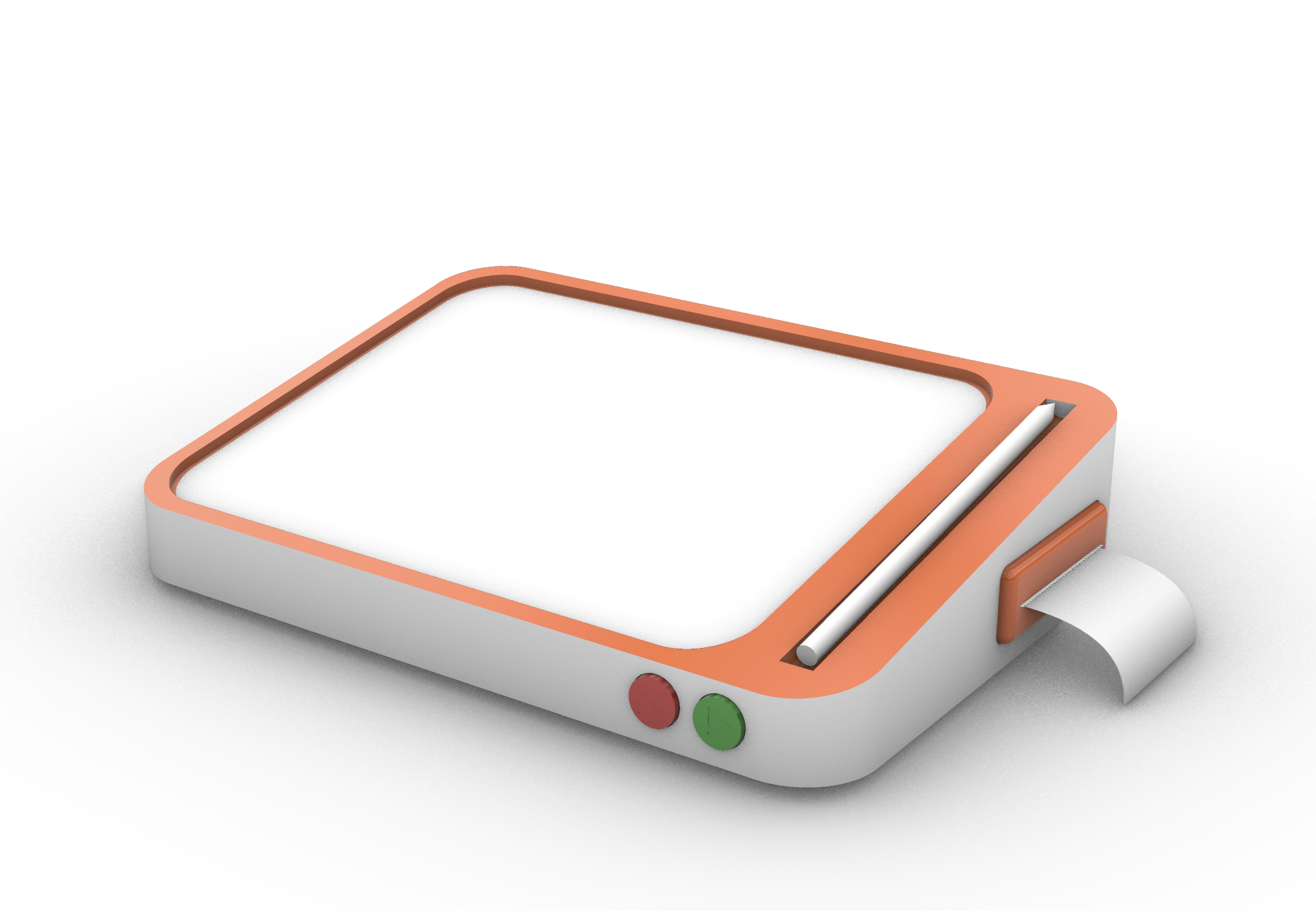
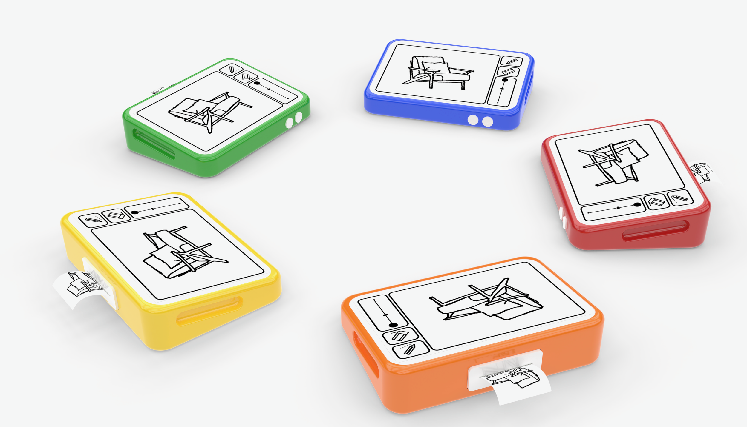
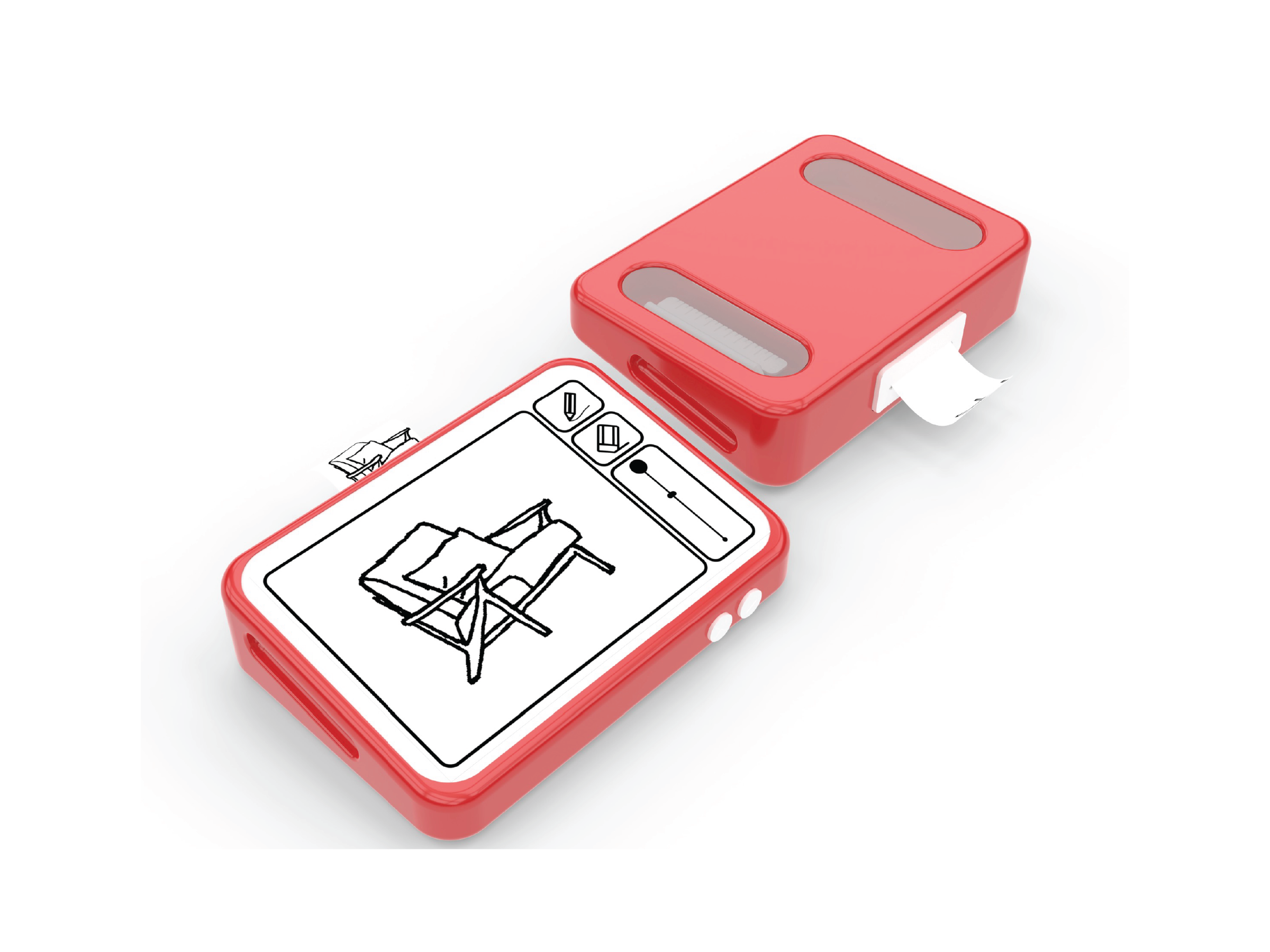
A simple offline sketching device for kids ages 8 to 14, designed to keep the focus on creativity without the distractions of tablets or laptops. Children draw on screen with a stylus and instantly print their work using a built in thermal printer. Drawings remain on screen after printing, allowing users to erase parts, revise ideas, and create multiple iterations. By combining rapid digital sketching with physical printouts, the device encourages hands on creativity and helps turn ideas into something real.
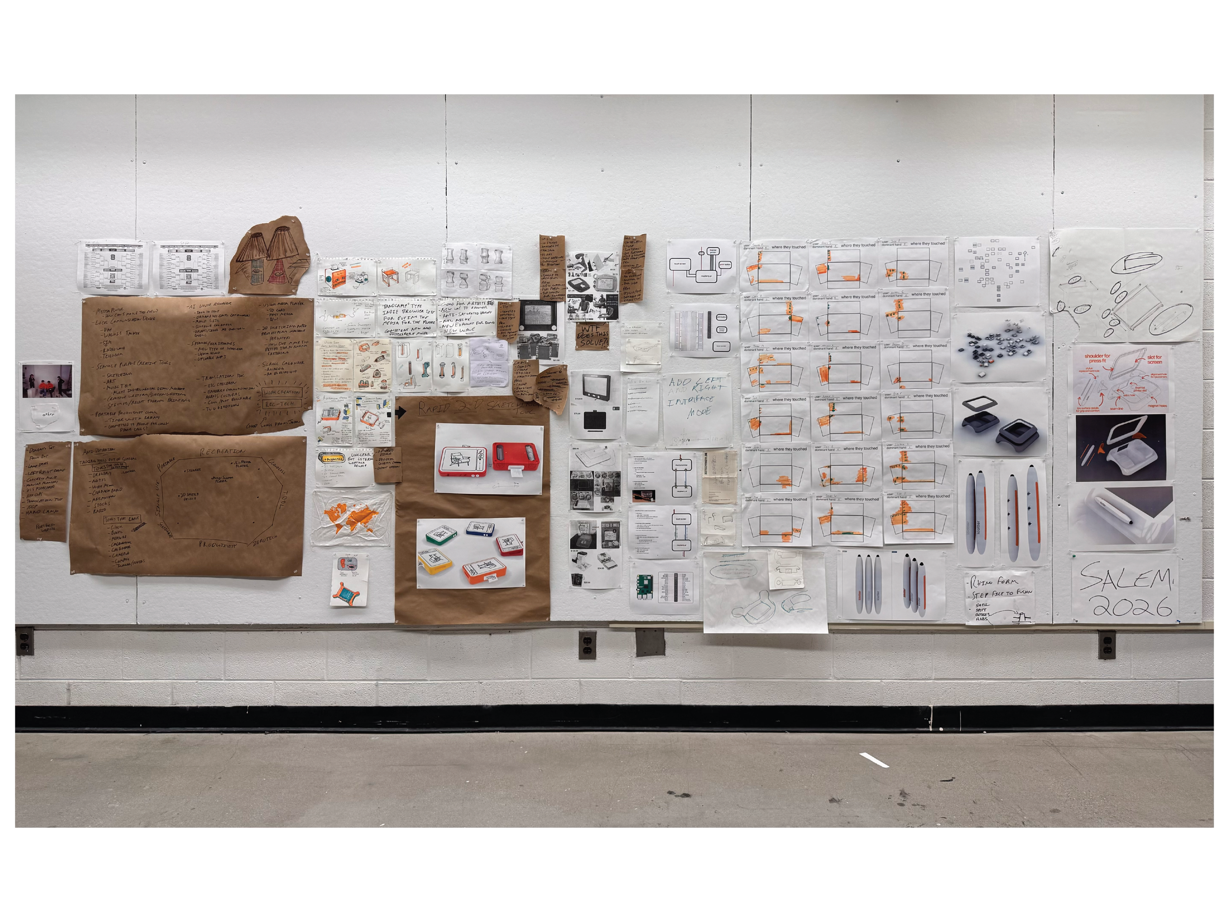
Sketches / primary ideation
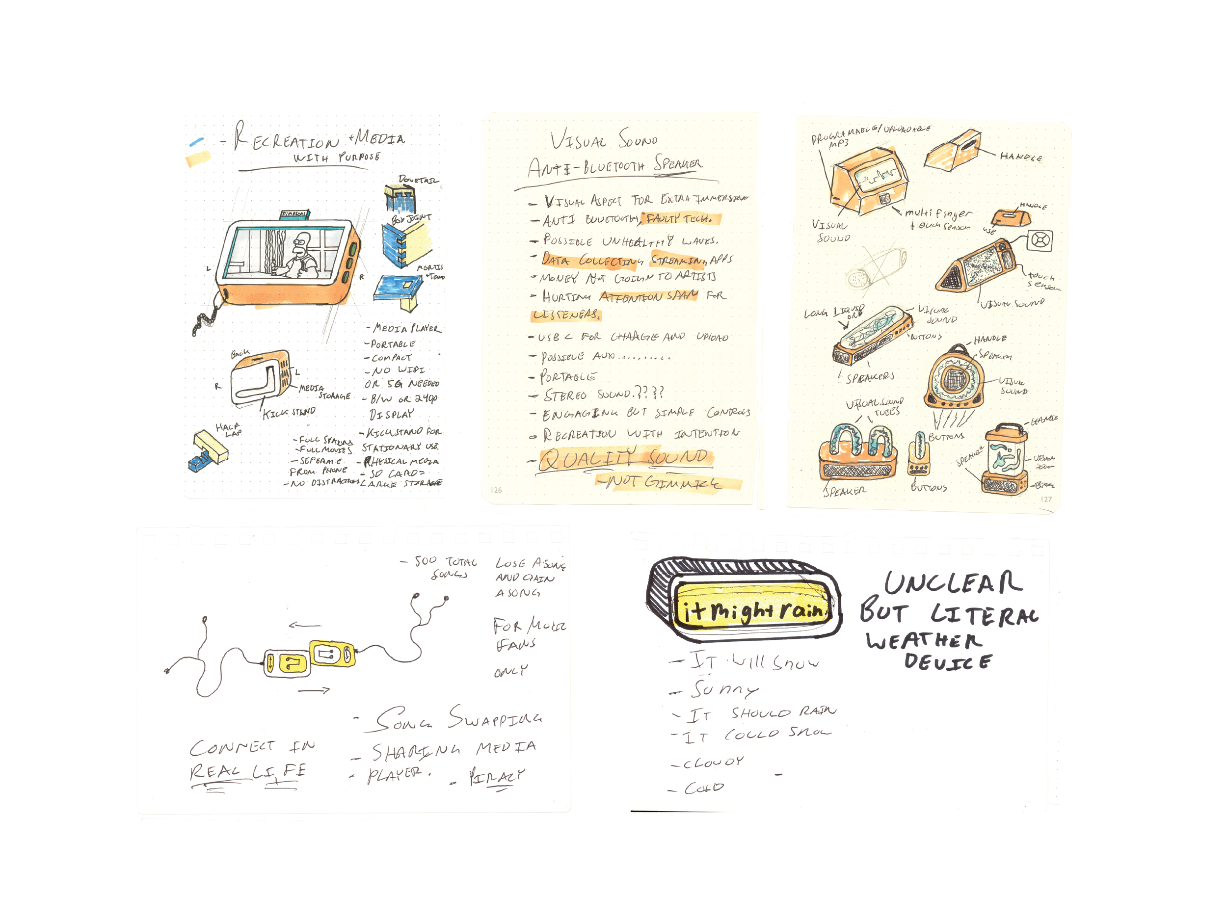
I began this 15 week open brief by asking what everyday digital tools could be removed from phones, laptops, and tablets, then reintroduced as focused physical products. Inspired by objects like calculators, alarm clocks, calendars, and typewriters, I explored ways to separate useful functions from the distractions of screen based ecosystems.
Early concepts included reviving products such as the MP3 player and portable video player through modern physical media formats, but these directions felt nostalgic rather than forward thinking. This led me toward a stronger opportunity: a dedicated 2D sketching device that restores drawing as a standalone experience, free from the multitasking demands of computers and tablets.
Rooted in my broader interest in turning digital experiences into tangible ones, I wanted this project to become more than another screen based drawing tablet. The concept evolved into an all in one sketching device that instantly prints drawings, transforming temporary digital files into physical outputs that remain visible, actionable, and easier to revisit.
This direction responds to what I think of as virtual clutter: unfinished sketches, voice memos, and creative fragments that disappear into folders and hard drives. By giving ideas an immediate physical presence, the device encourages follow through and keeps creative work in sight.
To compete with pen and paper, the product also preserves the advantages of digital tools. Users can print a sketch, keep it active on screen, erase sections, revise forms, and print iterations again. This creates a rapid prototyping workflow that combines the flexibility of digital editing with the clarity and permanence of physical media.
Target Audience
After identifying the opportunity for a dedicated sketching device, I focused on defining the right user. I found that children ages 8 to 14 would benefit most from a product centered on creativity without the distractions of multiuse technology.
Rather than designing a feature heavy tool that mimics professional software, I intentionally limited the device’s functions to drawing, printing, and simple editing. This creates a space between novelty toys and complex products, offering kids a focused tool that feels playful while still supporting real creative growth.
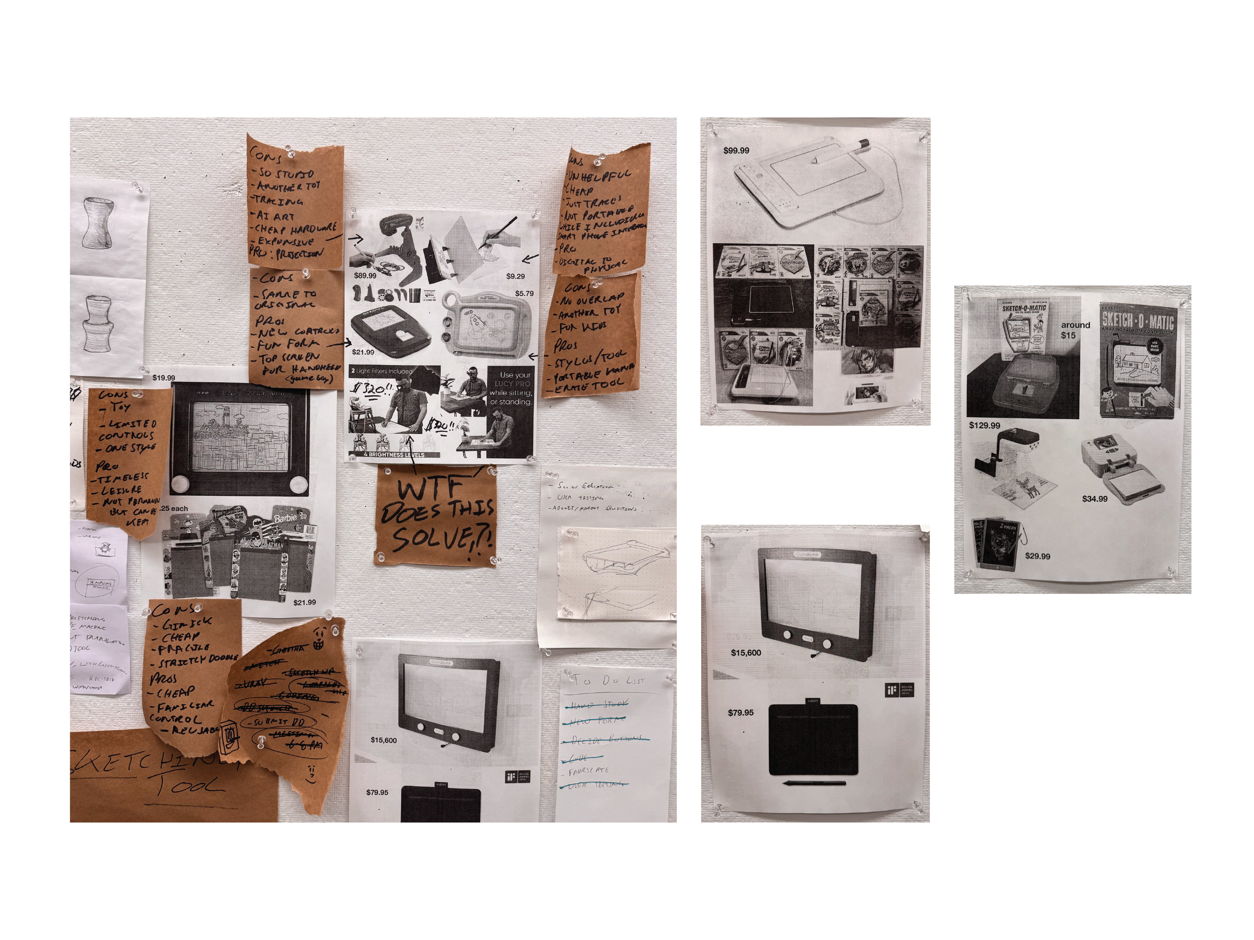
Market Precedence
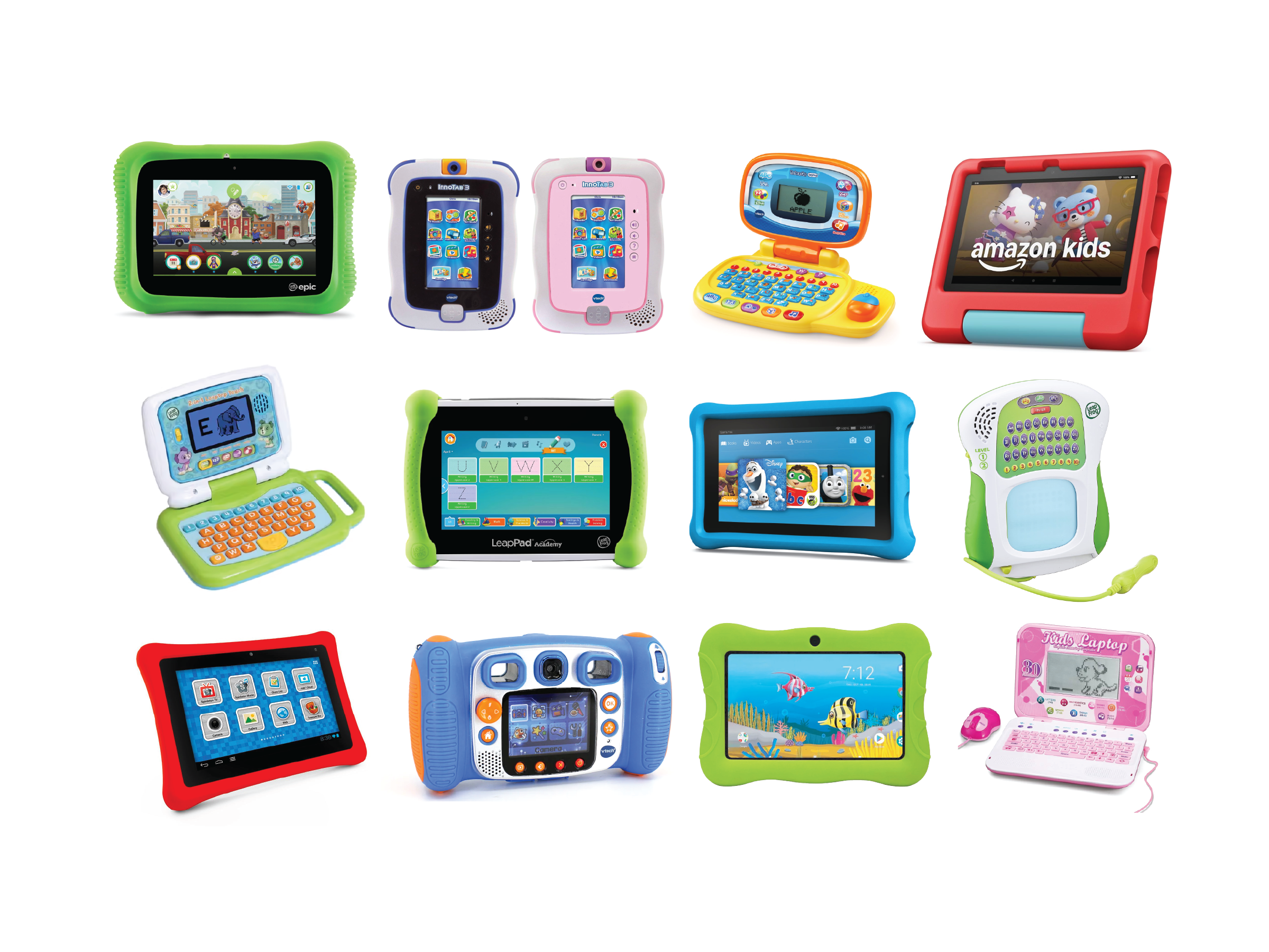
Through extensive research, I found a clear gap in existing products. Options were either expensive devices packed with unnecessary features, or low cost disposable toys with limited creative value. Products like the Etch A Sketch offered playful interaction, but lacked precision, control, and ways to preserve finished work.
No existing product combined focused digital sketching with an immediate physical output. The built in thermal printer introduced a unique opportunity to save ideas in the real world, giving drawings permanence while encouraging iteration, display, and continued engagement beyond the screen.
Early Concepts OF DEVICE
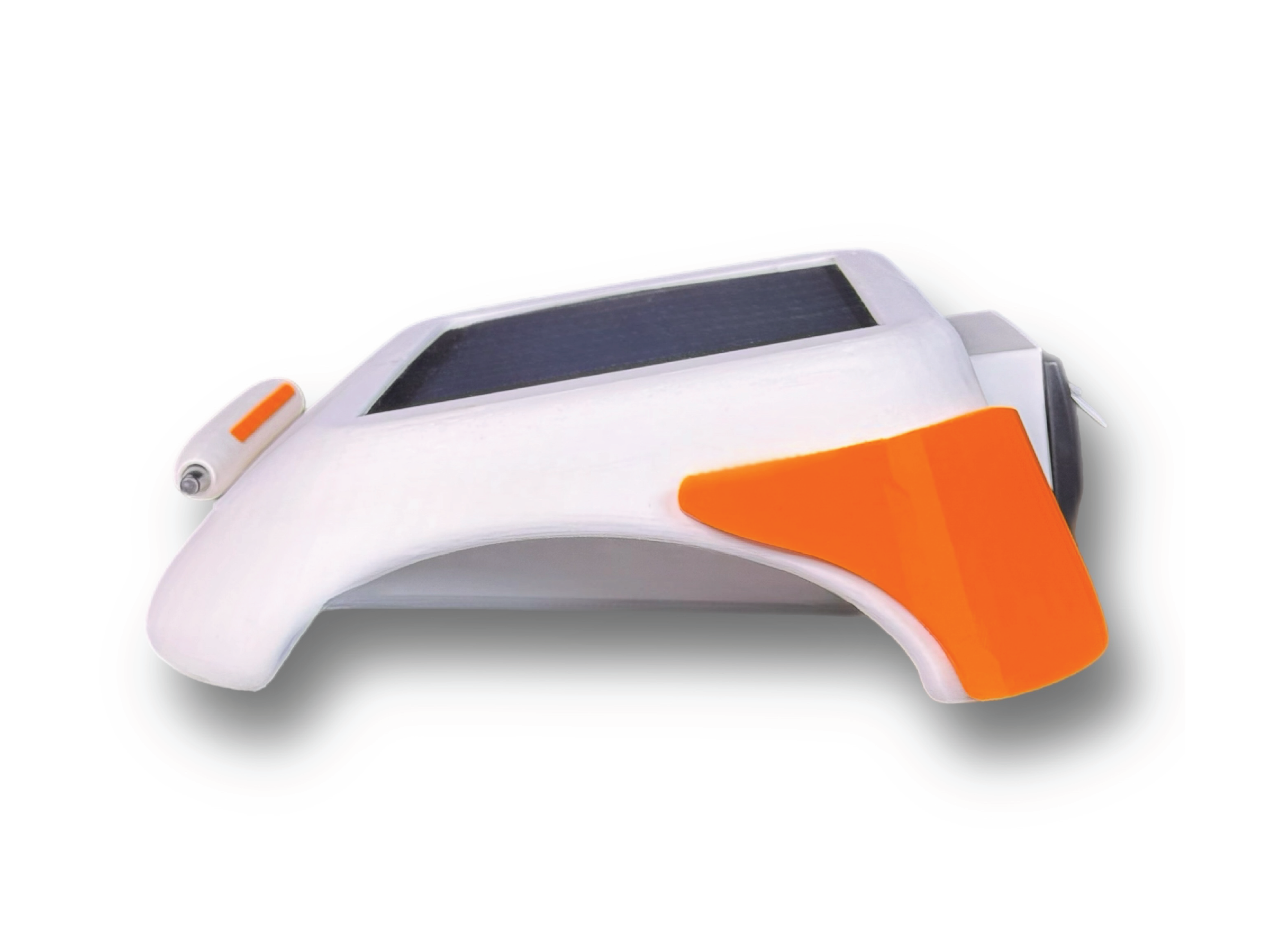
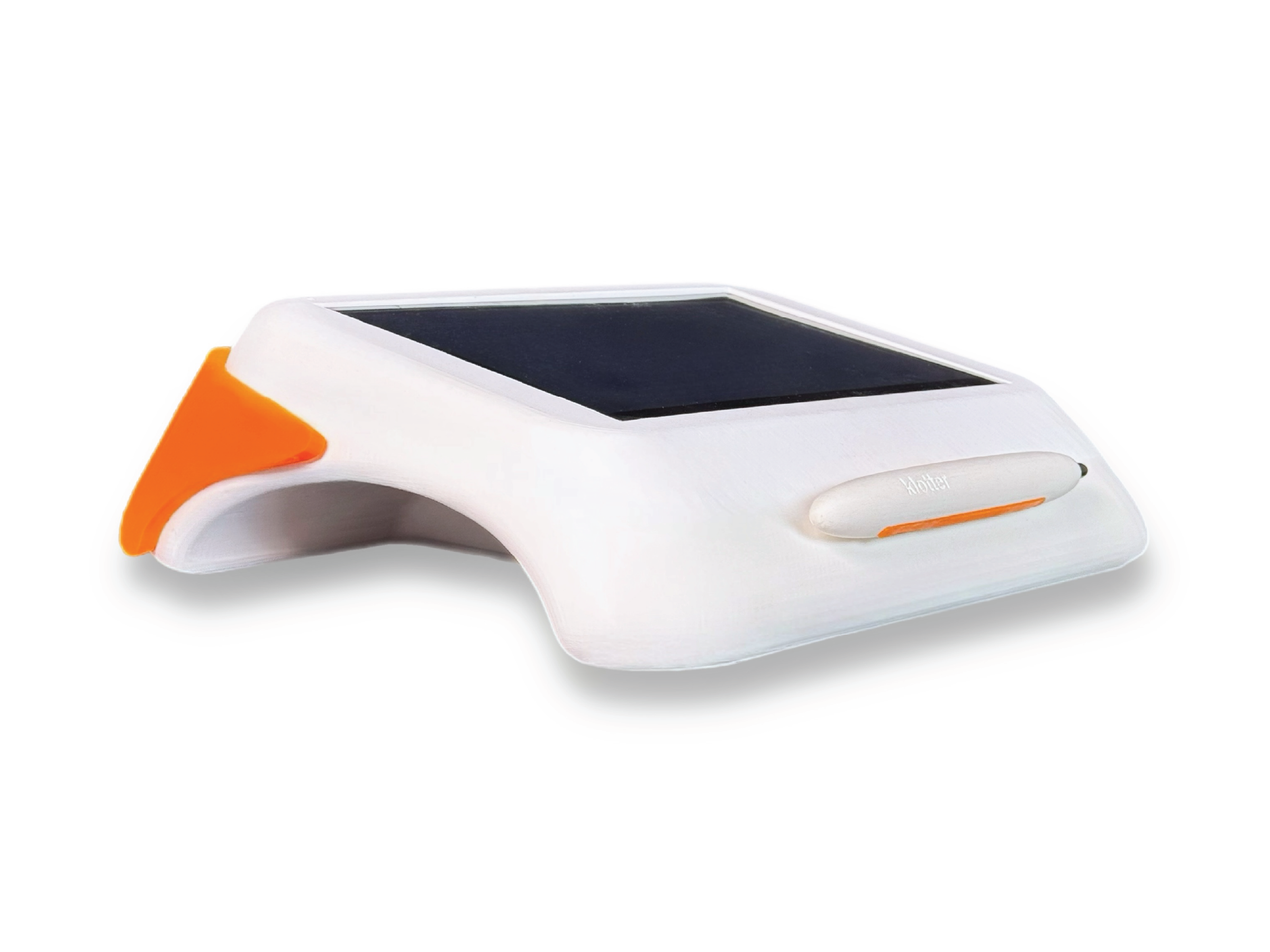
At the start of the design process, I assumed the product’s form would be heavily constrained by the large screen, making it difficult to move beyond a standard tablet-like rectangle without sacrificing comfort or usability. I moved quickly into 3D exploration to test these boundaries.
Through early modeling, I realized the form should not begin as a visual gesture, but from the way the user physically interacts with the device. Understanding grip, posture, drawing angle, and printing behavior became essential in shaping a product that feels intuitive and distinct.
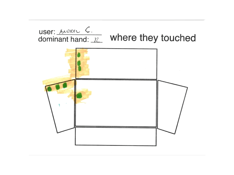
observational hand study
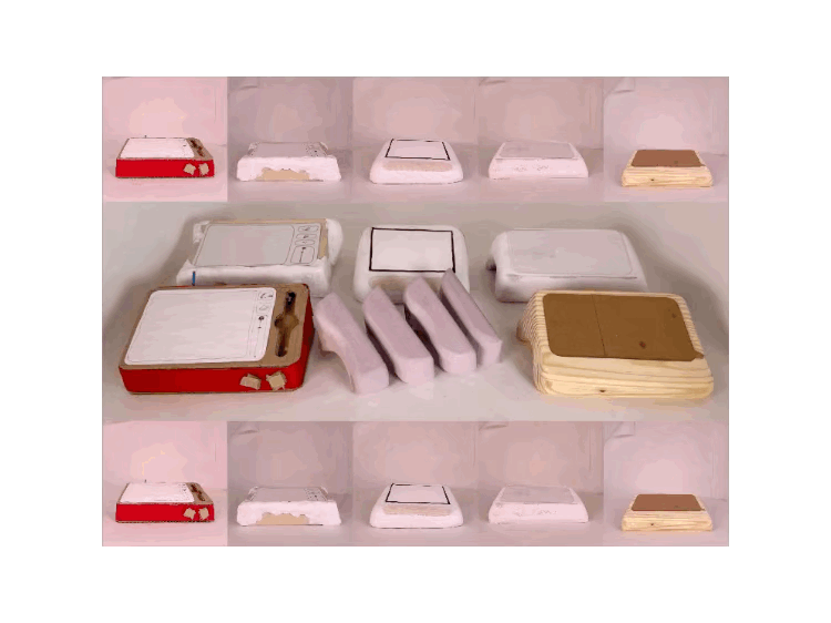
I created an early cardboard prototype using a simple box form with a basic drawing angle, then conducted in person user studies to observe where palms, fingertips, and wrists naturally contacted the device. This research gave me clear ergonomic data that informed the next stage of development, allowing the form to better accommodate natural hand placement and improve comfort during use.
visual & material language
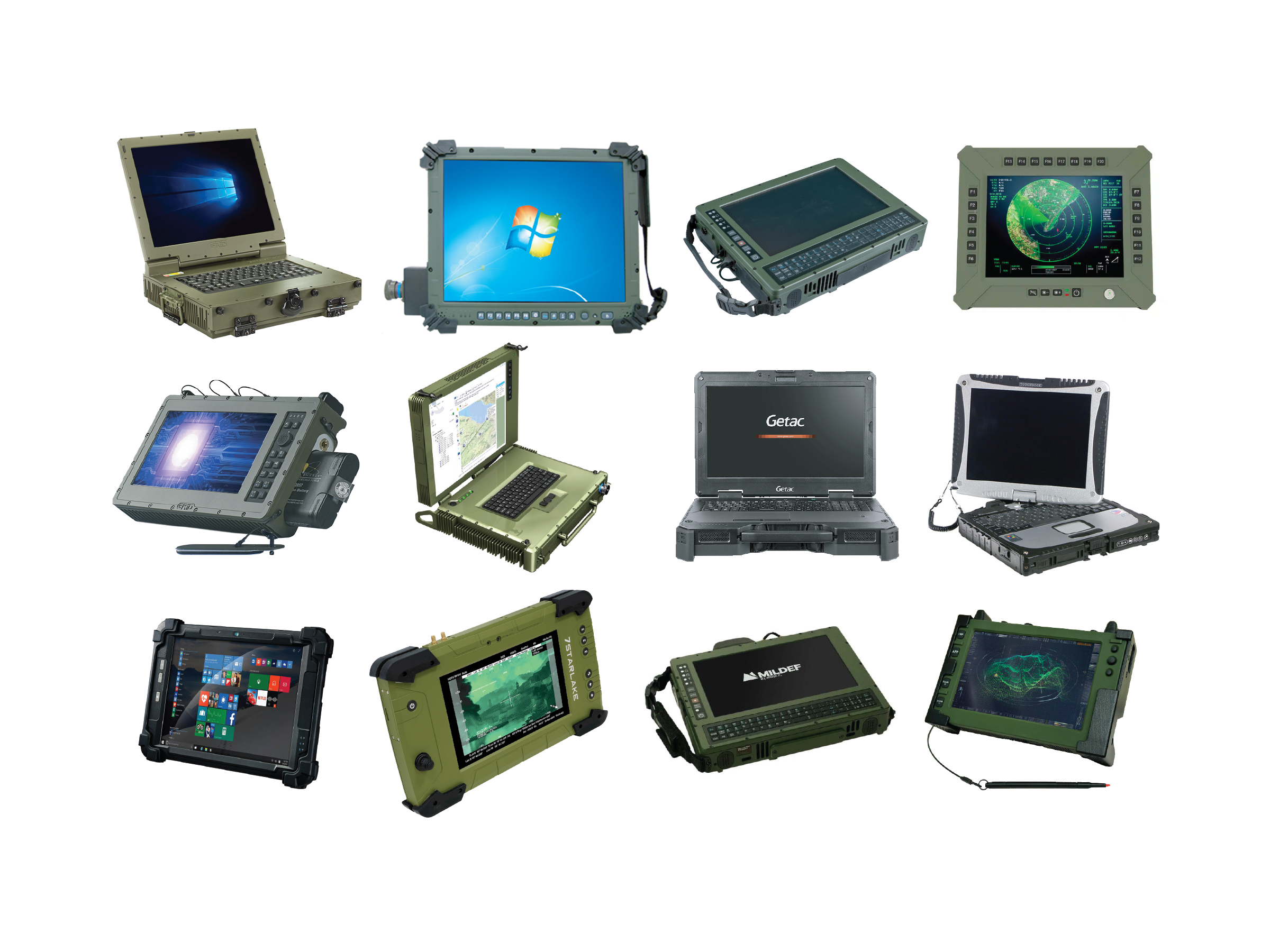
While the hand studies helped define overall form, they did not address surface treatment or durability. To guide these decisions, I researched children’s toys and tablets for softness, color, and playability, while also studying rugged outdoor and military equipment built for impact resistance and reliability.
Across both categories, I noticed consistent design patterns: styluses were securely attached to the product, corners were softened for grip and protection, carrying features were intuitive, and screen based devices reserved clear thumb placement zones to prevent accidental interference. These insights became key references for the next phase of development.
form exploration
I then returned to form development with two major constraints in mind: responding to the hand study findings and housing the internal components required for the prototype. These requirements initially made the product feel oversized, since many of the parts demanded significant space.
To counter this, I refined the volume by compressing unused areas and removing unnecessary mass wherever possible. This created the visual impression of a smaller, lighter product while improving balance and adding more character to the overall silhouette.
embedded programming
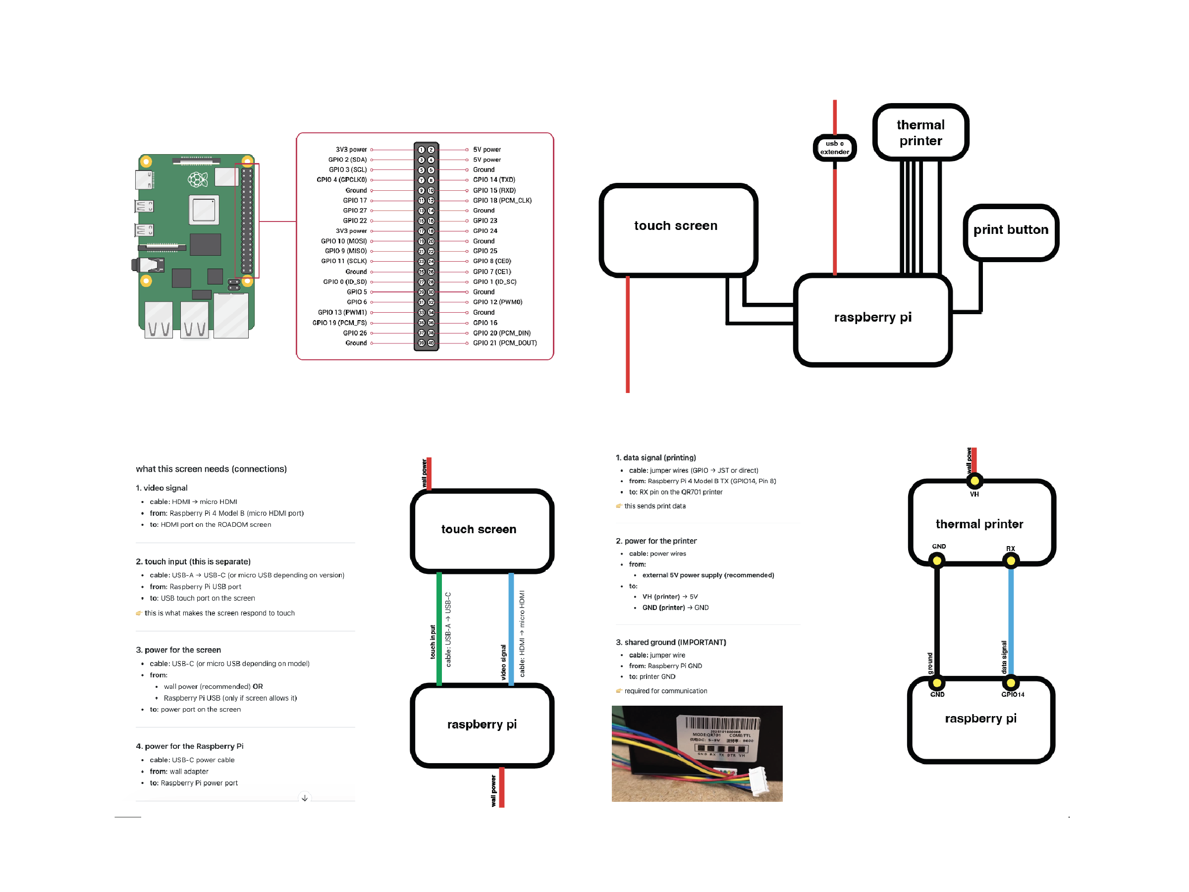
This project also marked my first experience using Raspberry Pi after years of working with Arduino. It was a highly rewarding process filled with constant learning, iteration, and problem solving. Once I established an effective Pi workflow, I was able to rapidly build upon the codebase, resulting in a polished experience with fully functioning features, clean wiring, and an intuitive interface.
ui design
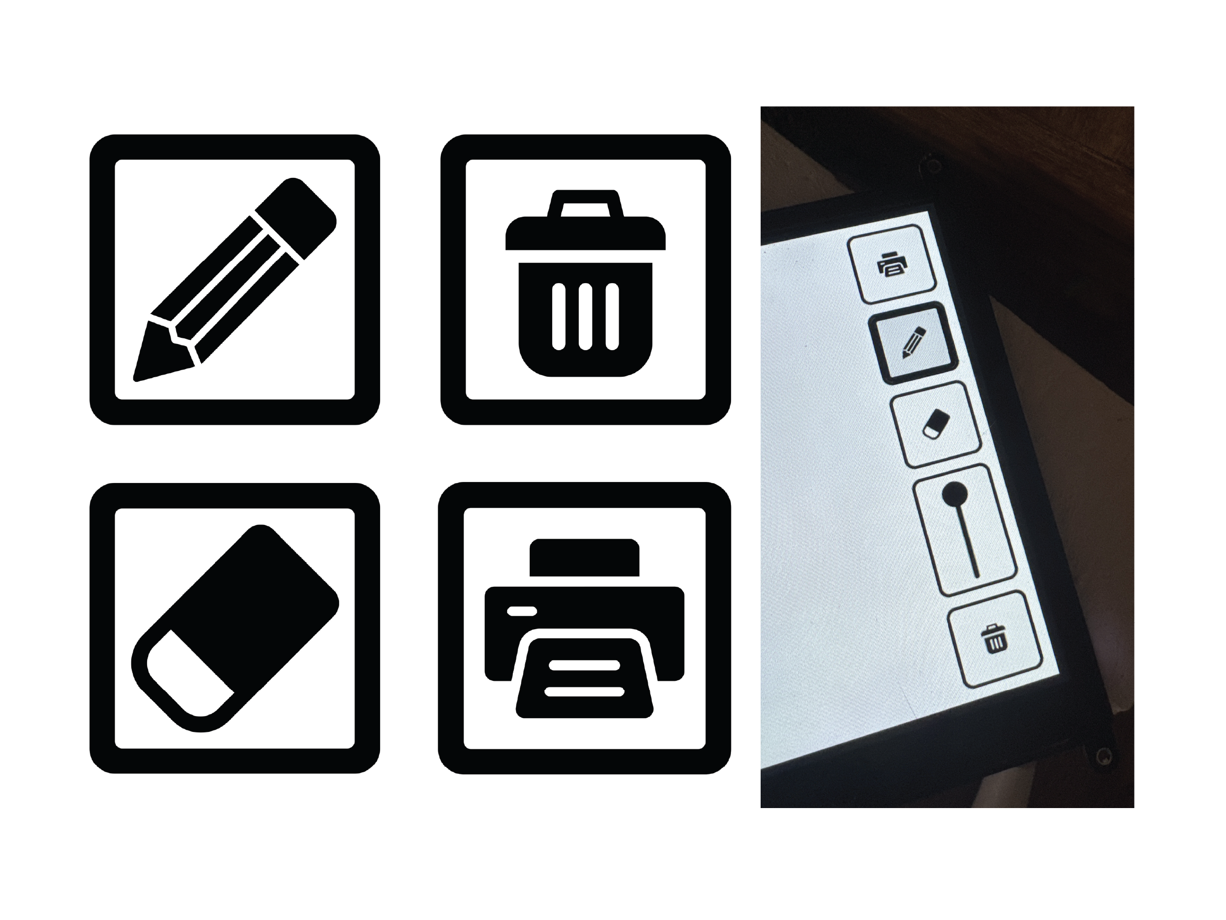
I especially enjoyed refining the virtual interface by developing clear, easy to understand iconography and playful visual language. Creating the startup graphic was equally rewarding, blending the nostalgic excitement of early devices like the Game Boy Advance SP and PlayStation 2 with a more youthful bouncing animation inspired by classic children’s learning electronics.
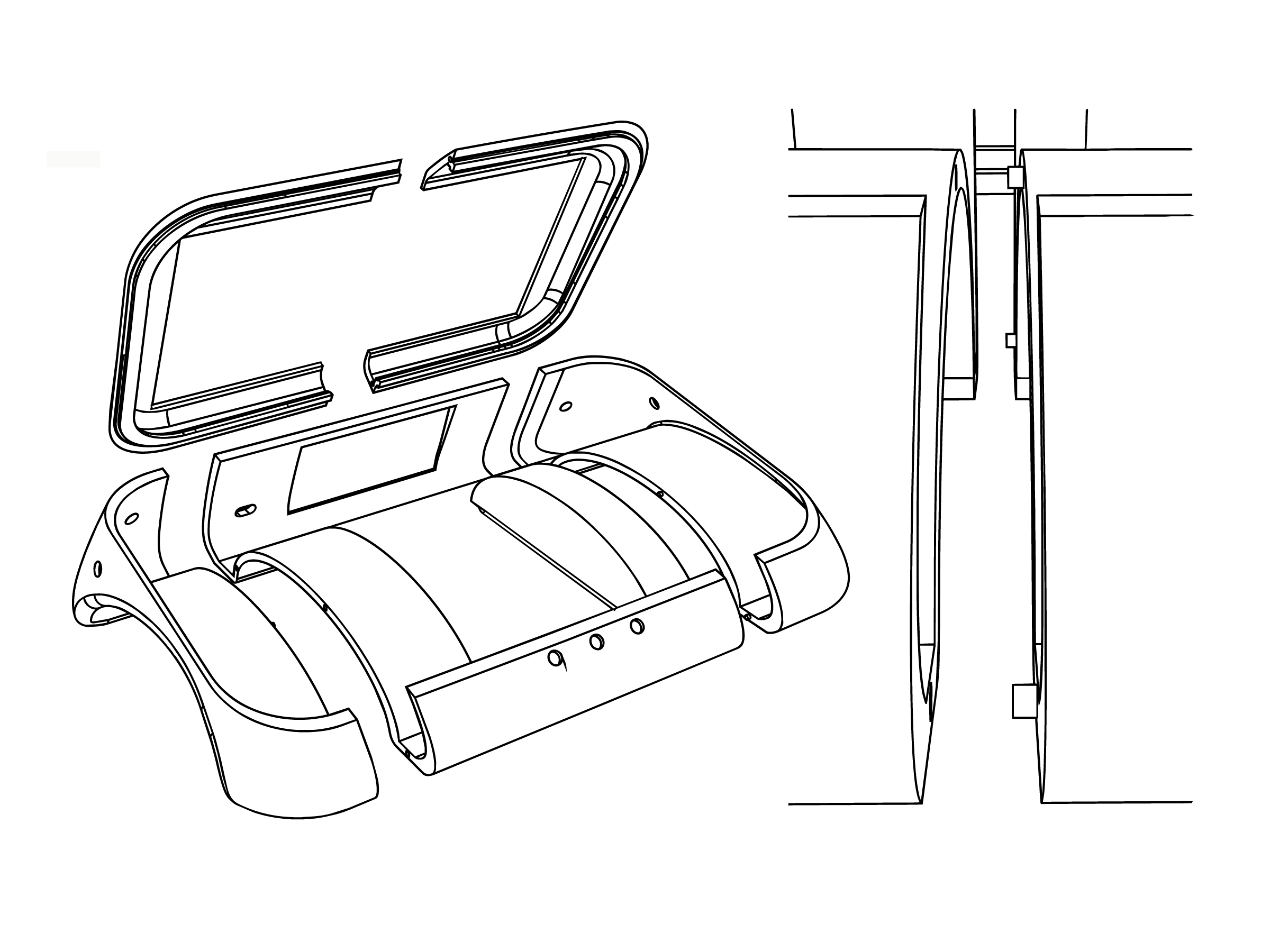
3d modeling
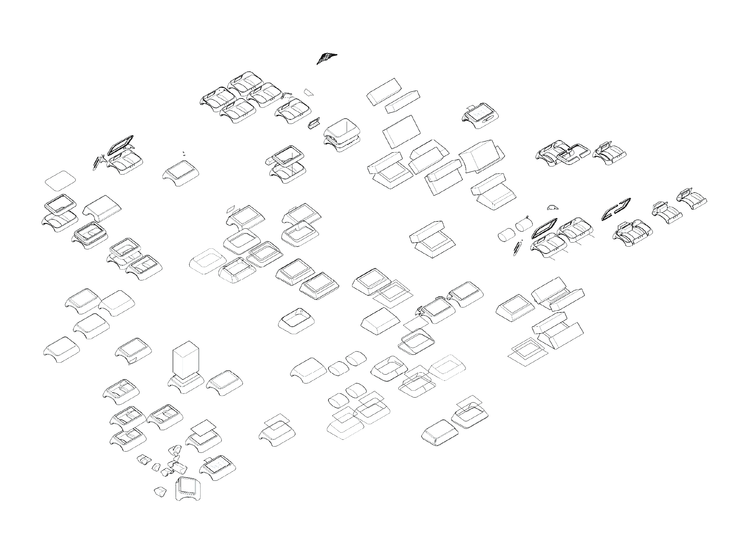
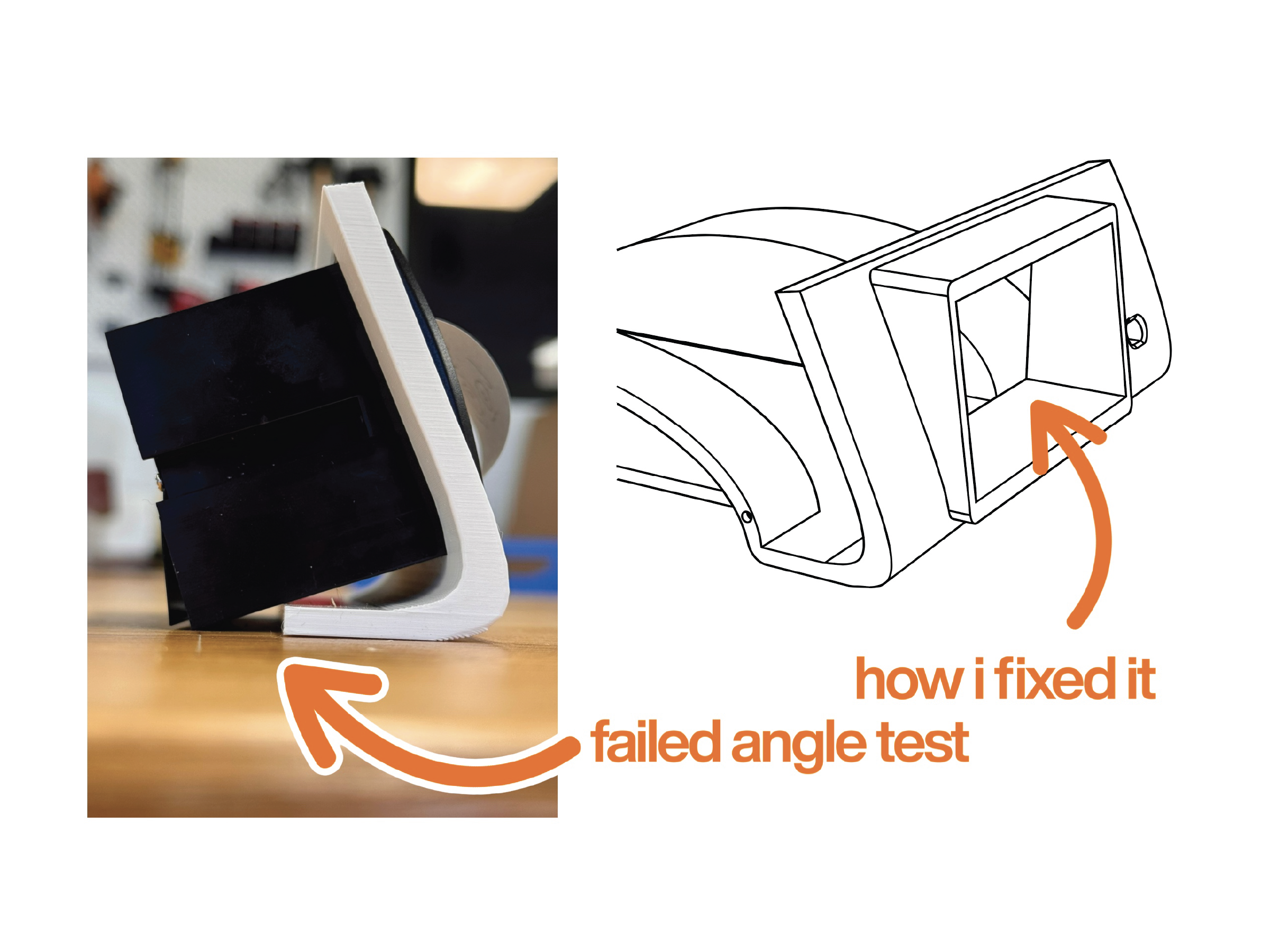
When moving into CAD, I had to balance form development with precise dimensional planning. After multiple fit tests and laser cut mockups, I refined how components would align, what angles they required, and how insights from physical studies could be accurately translated into a digital model.
Once the layout and form were resolved, the next challenge became manufacturability. I began designing beyond the prototype stage by considering how the product could be mass produced through tooling, material selection, seam lines, assembly strategy, and overall production cost.
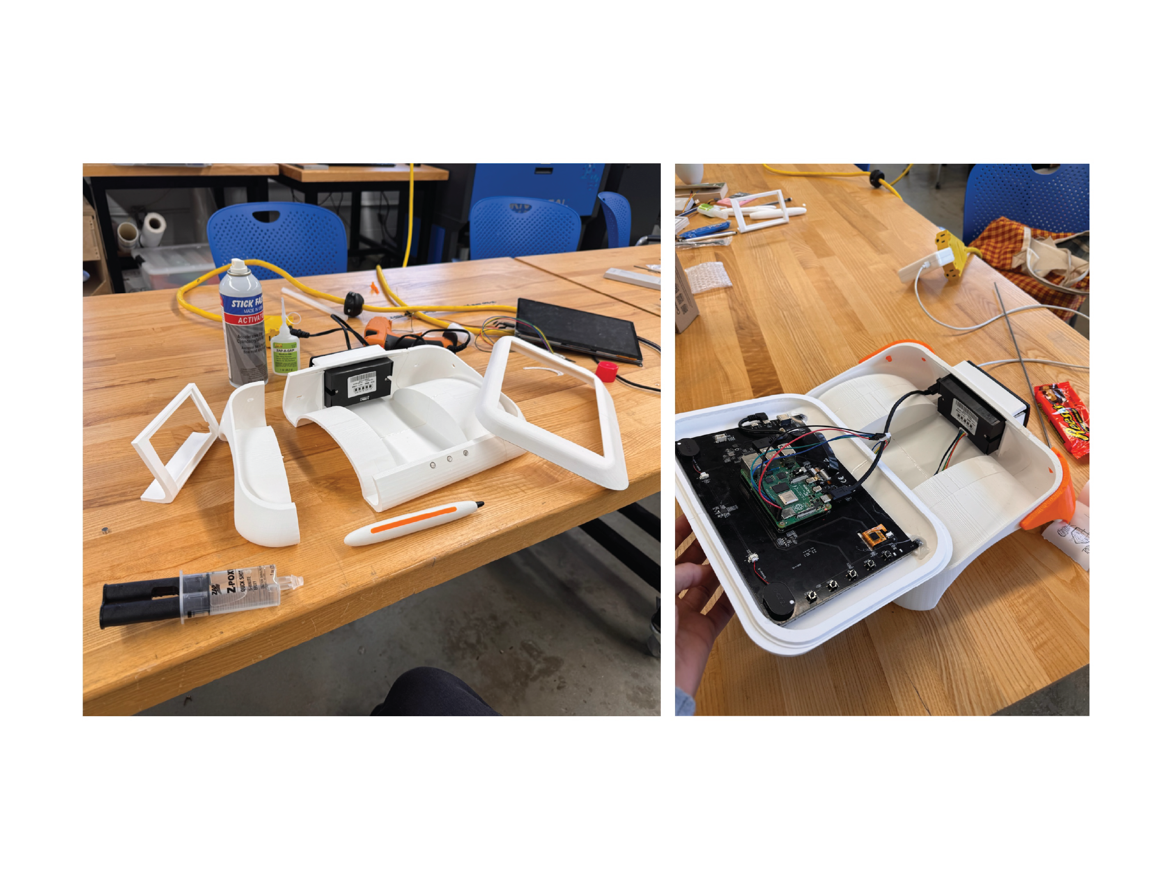
making
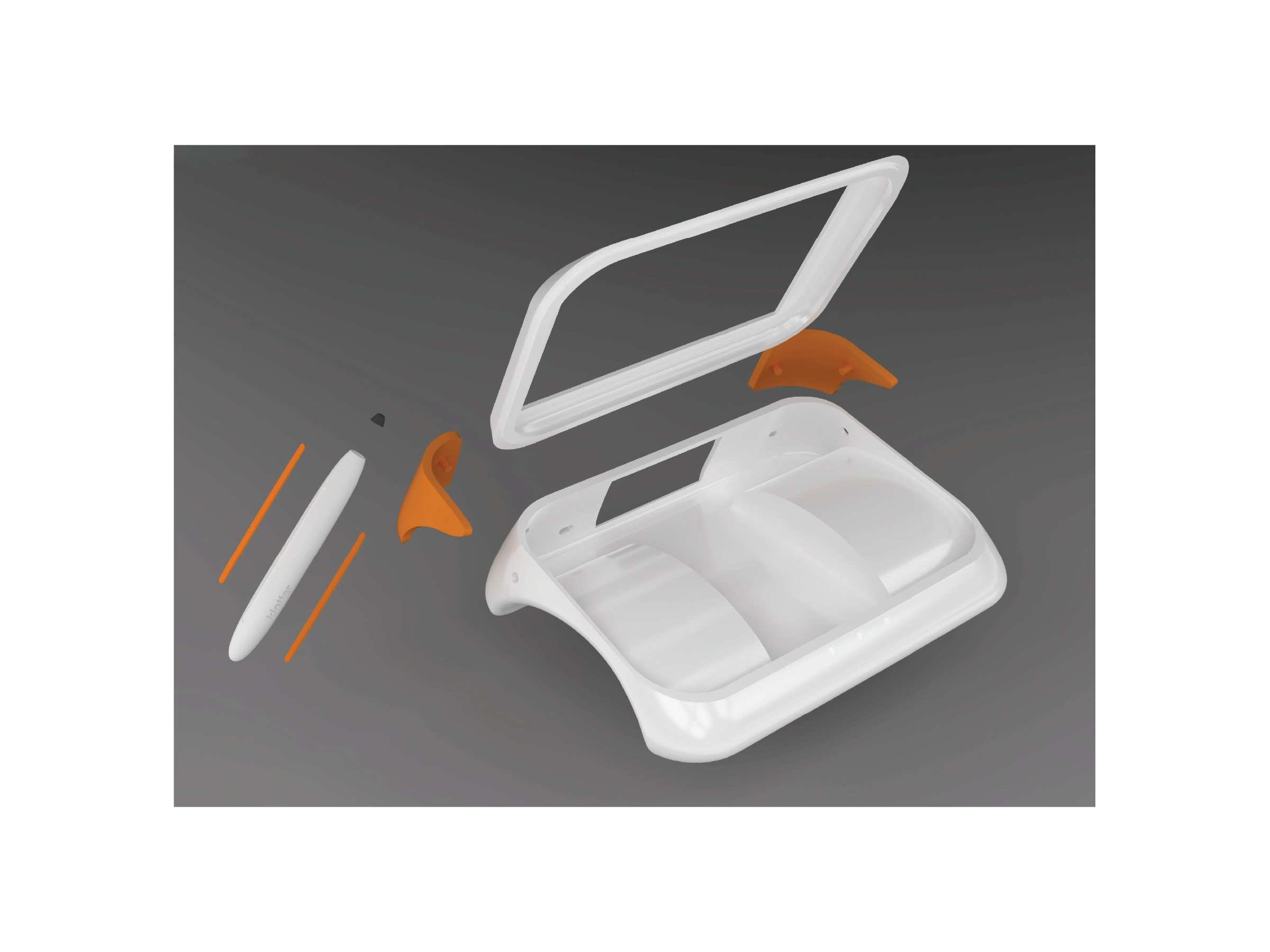
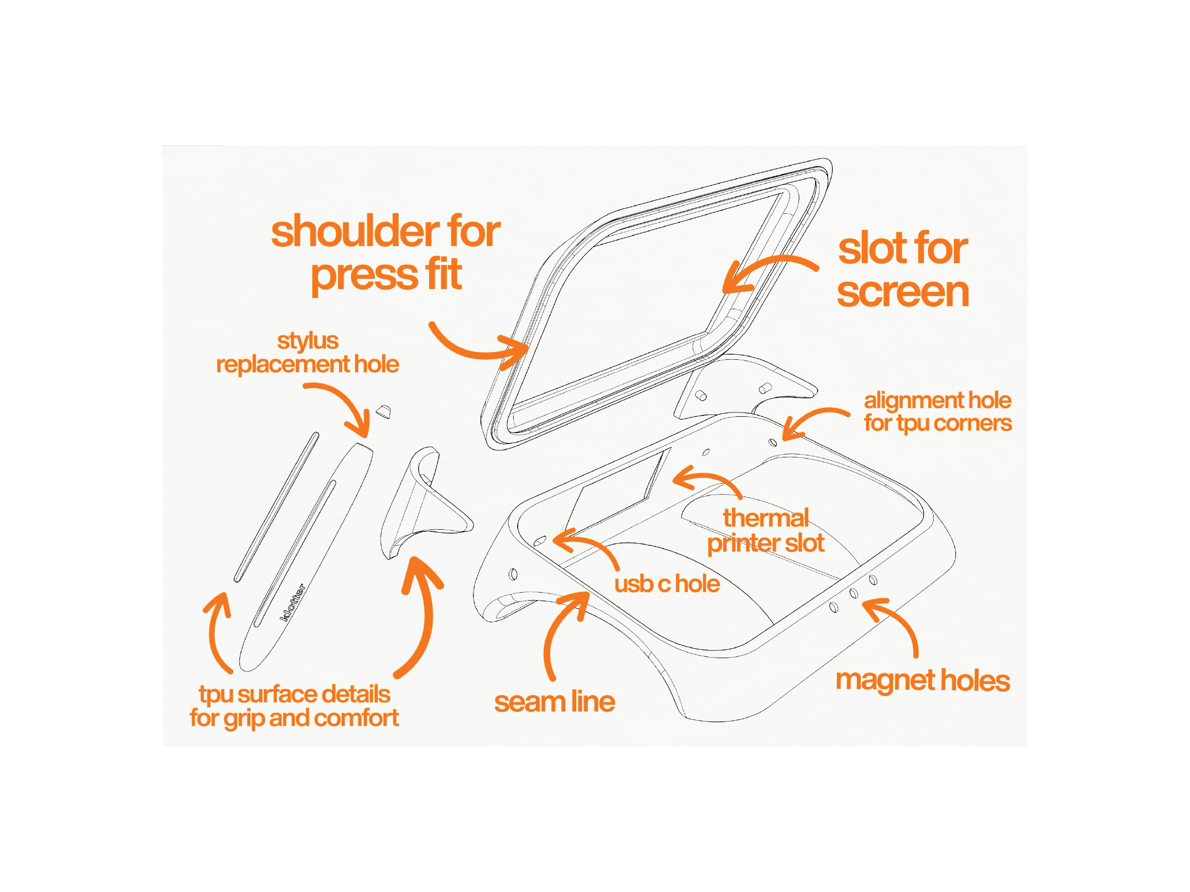
Fabrication was met with more difficulties as well, things such as 3D printer being too small for some of my parts, as well as tolerance issues, print quality issues with the orientation of how I put my parts on the plate, as well as some things in the real world not working the way I imagined they would in CAD. I also had to add things like brims and bosses for anything that I was going to mount, like my screen.
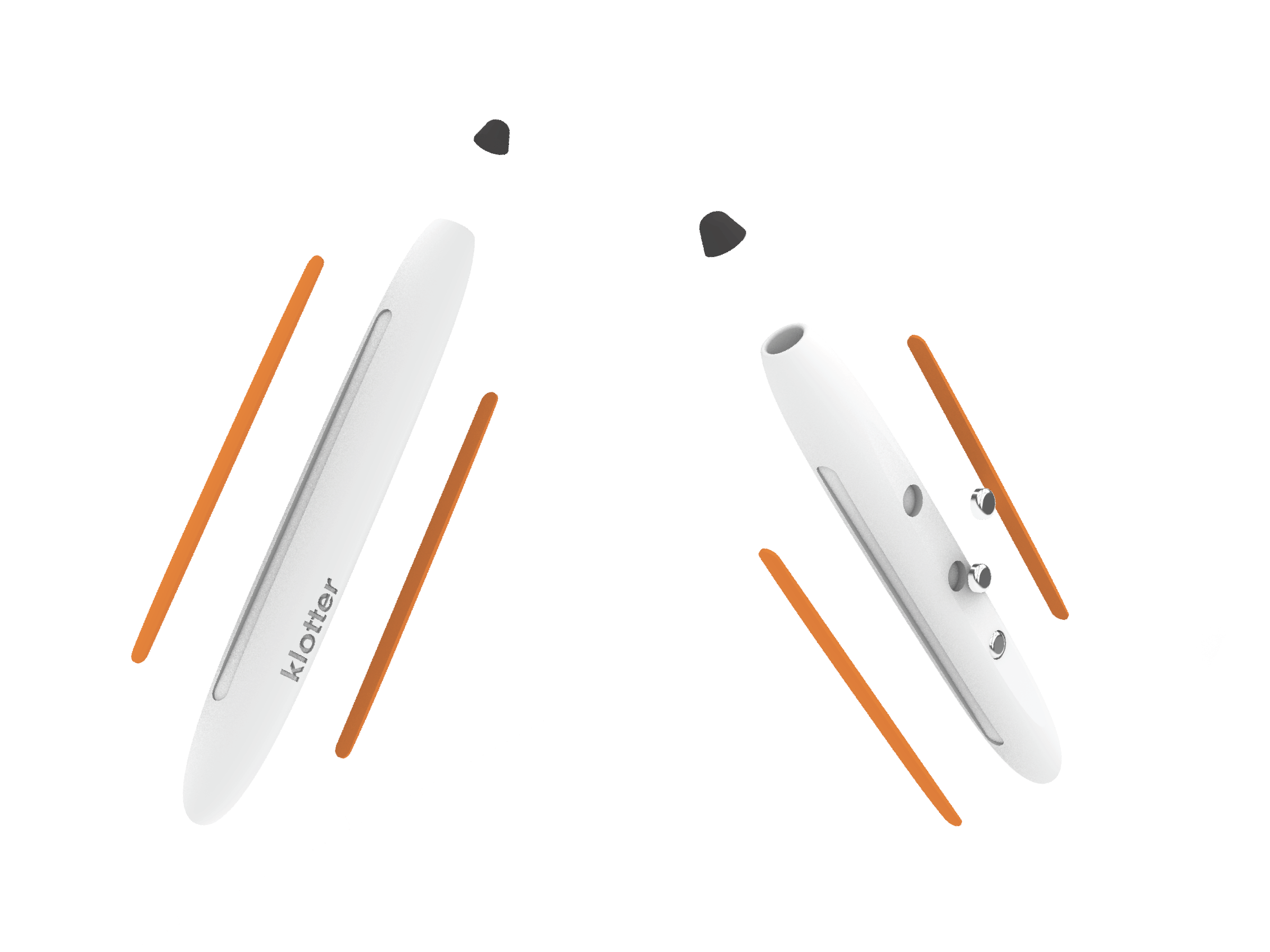
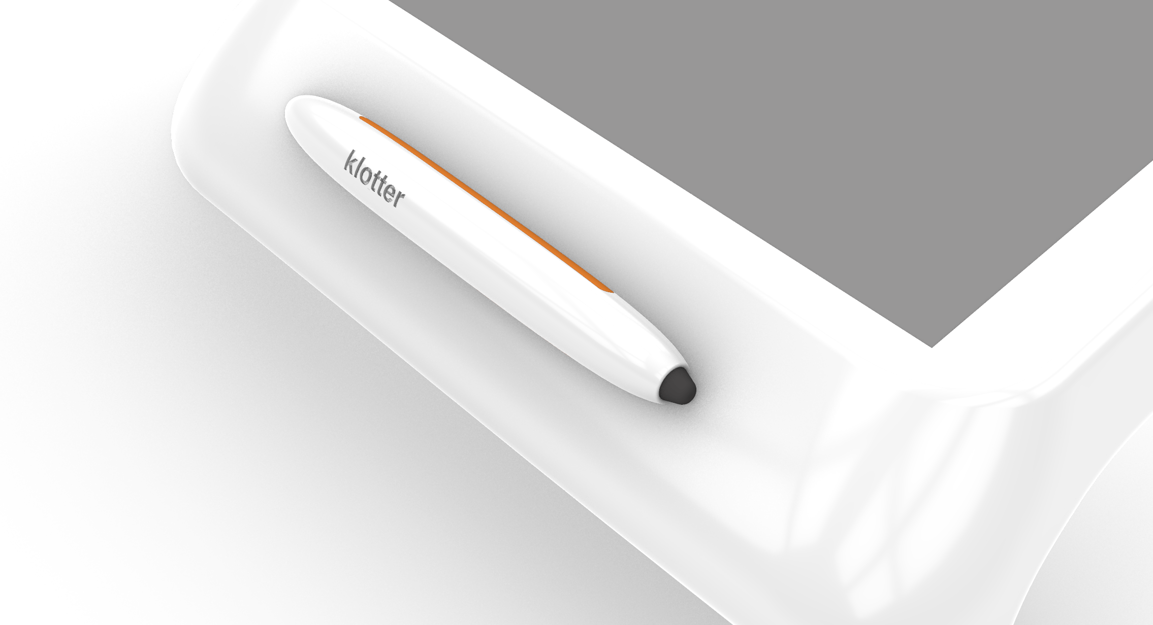
child-friendly stylus
Designing the stylus introduced a new challenge: integrating an external component without disrupting the overall form. Solutions such as tether cords or dedicated storage compartments felt visually distracting and too juvenile for the intended age group. Instead, I developed a stylus that could rest naturally within the product while remaining accessible and sized appropriately for younger hands, allowing for comfortable and flexible grip styles during use.
I also used the stylus as a subtle opportunity for branding (supported by a custom startup graphic shown on boot). Rather than placing logos prominently on the body of the product, I chose to keep branding minimal, allowing the form, function, and user experience to remain the focus.